The Sip Society
An English tea room by day, a speakeasy after dark. One identity for both.
The Sip Society is an all-day space in Sector 10, Chandigarh. The founders had a clear vision: European, quietly luxurious and centred on blue, with interiors already taking shape. As lead brand designer, I developed an identity that could move from tea to cocktails, bringing expressive typography and a little vintage whimsy to a classical brief. I carried the identity into menus, print, packaging, uniforms and launch templates.
Classical, with room to play.
The identity needed to work across two different occasions while sitting comfortably alongside the interiors, crockery and materials being selected for the space.
I explored three territories: the tactile richness of Victorian interiors, the geometry of Art Deco, and a softer world of botanical references and classical paintings. Art Deco felt too much like a cocktail bar for a tea room, and was set aside.
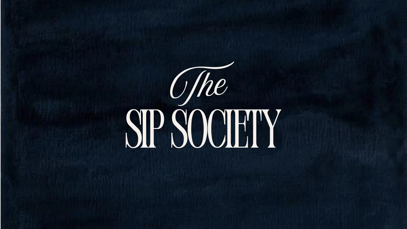
From there, I developed a series of wordmarks, testing different balances of serif and script across signage and small applications. The chosen pairing had the best typographic balance: the condensed serif kept the classical structure, while the script brought a more expressive character.
“Design a space that tells a story as the day unfolds.”Akarshan Brar Gill, founder · Restaurant India ↗
+ The briefIn the founder’s words
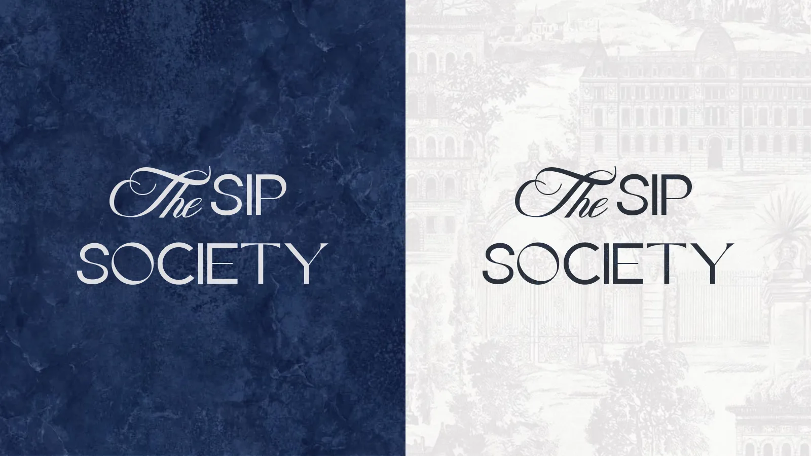
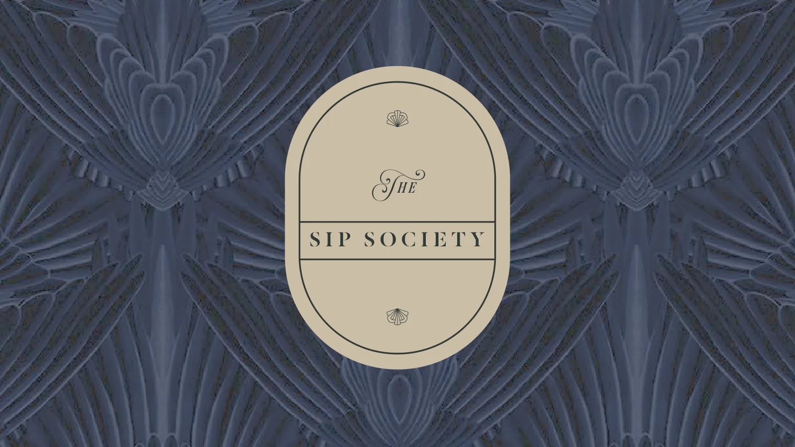
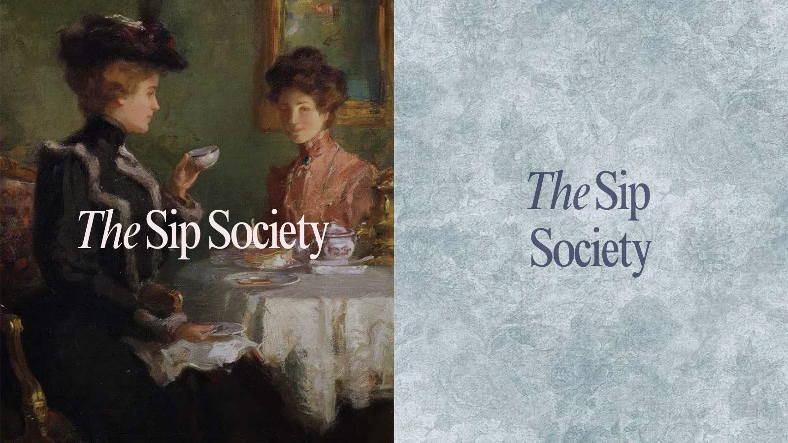
+ Round oneThree visual territories, explored through colour, texture and typography.
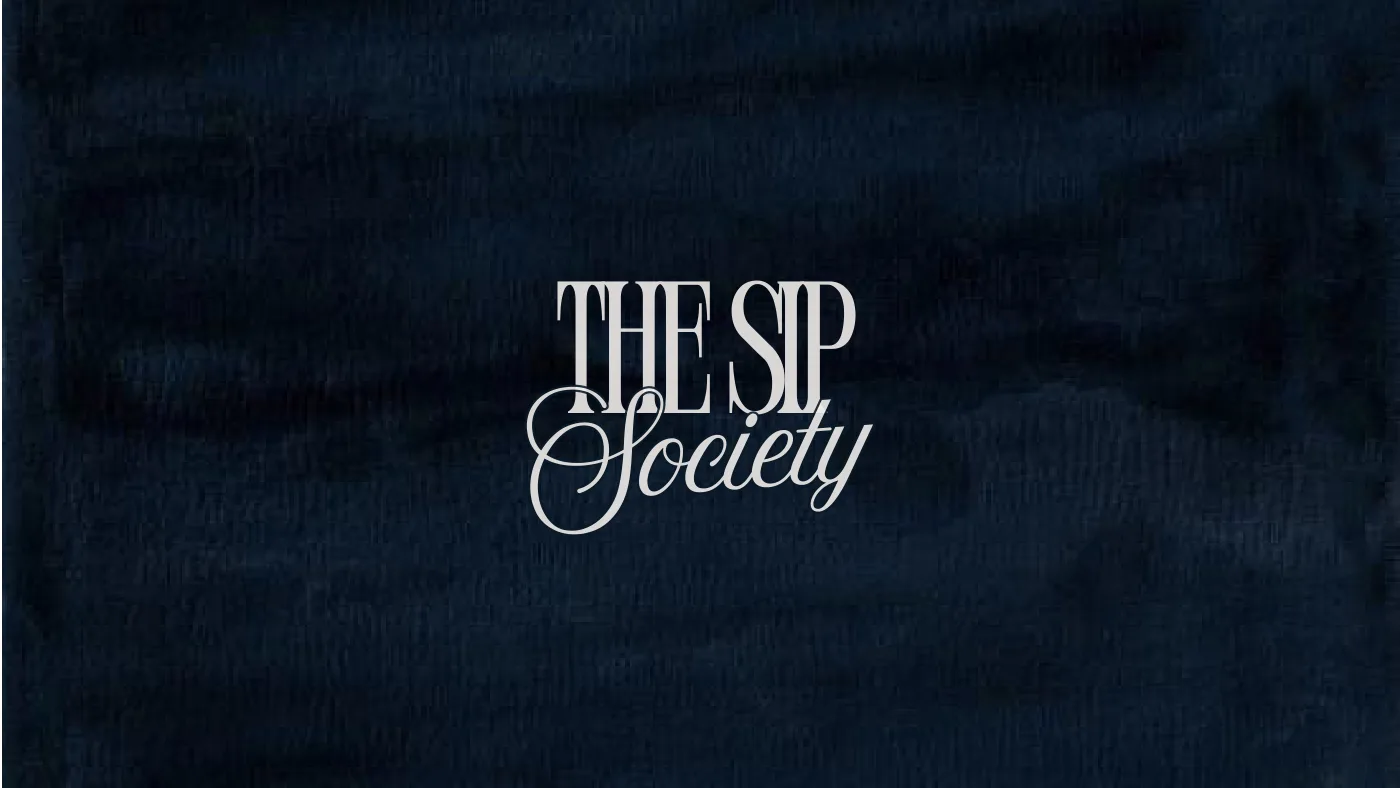
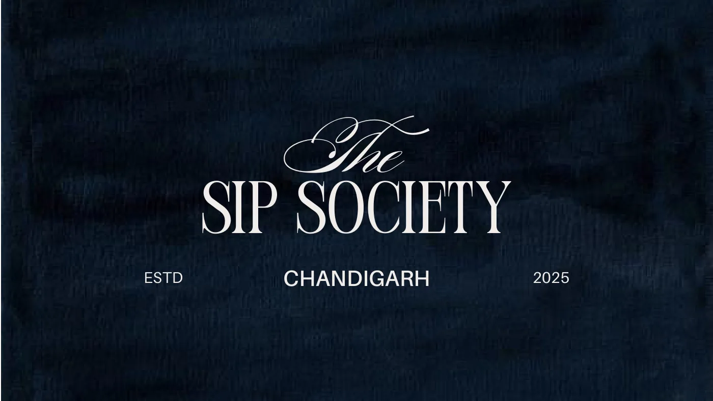
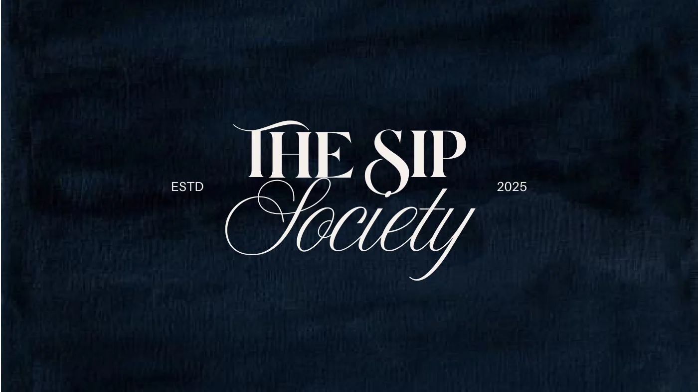
+ Round twoWordmark options tested across signage and coaster mockups.
Classical, but make it contemporary.
The founders wanted a distinctly European identity. I wanted to preserve that richness while making it feel fresh and inviting, rather than overly ceremonial.
The balance came through contrast: giving expressive details room to stand out, then keeping the surrounding elements restrained. Lighter and deeper colour variations allow the mood to shift throughout the day.
The aim was one recognisable identity with enough flexibility for both occasions, without making the tea room and speakeasy feel like separate places.
+ The wordmarkCondensed serif with a script S



+ The markBuilt on the golden ratio
+ Logo familyWith the emblem above, without it below
+ Condensed serifHeritage, set tall and tight
+ AmoresaOne accent word at a time
+ SwitzerLight, for everything you read
It is a space that invites you to stay a while. To have real conversations. To drink slowly. To eat well. And to savour your time.
+ Type hierarchyFrom the brand introduction
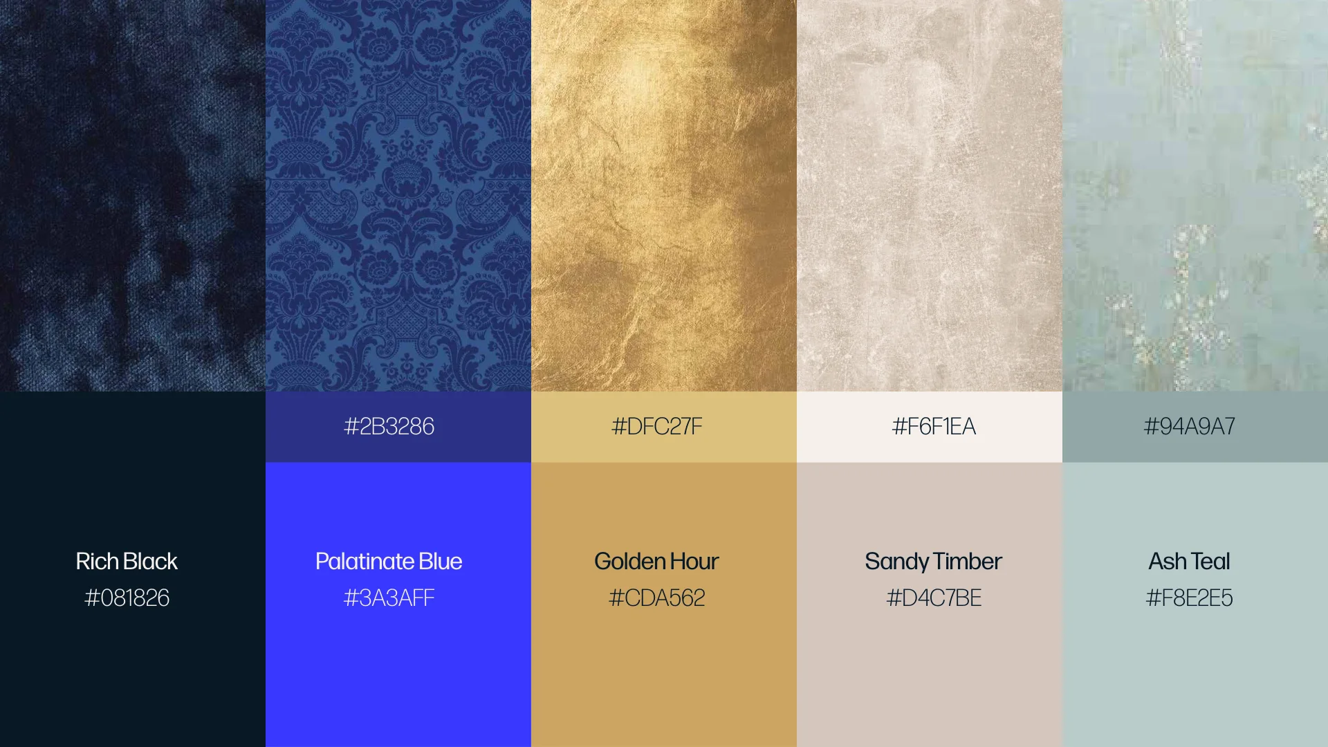
+ Colour paletteFrom the brand guidelines
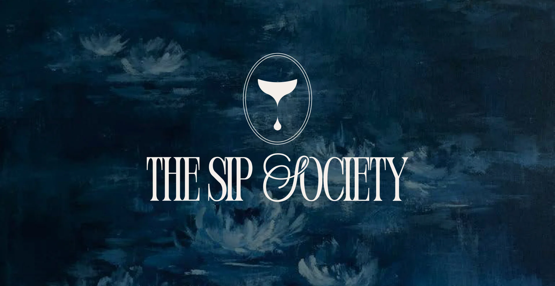
+ The identityCover of the brand guidelines
Art on every surface
The type and logo stay the same all day. Lighter shades carry the tea room, and deeper ones take over for the bar.
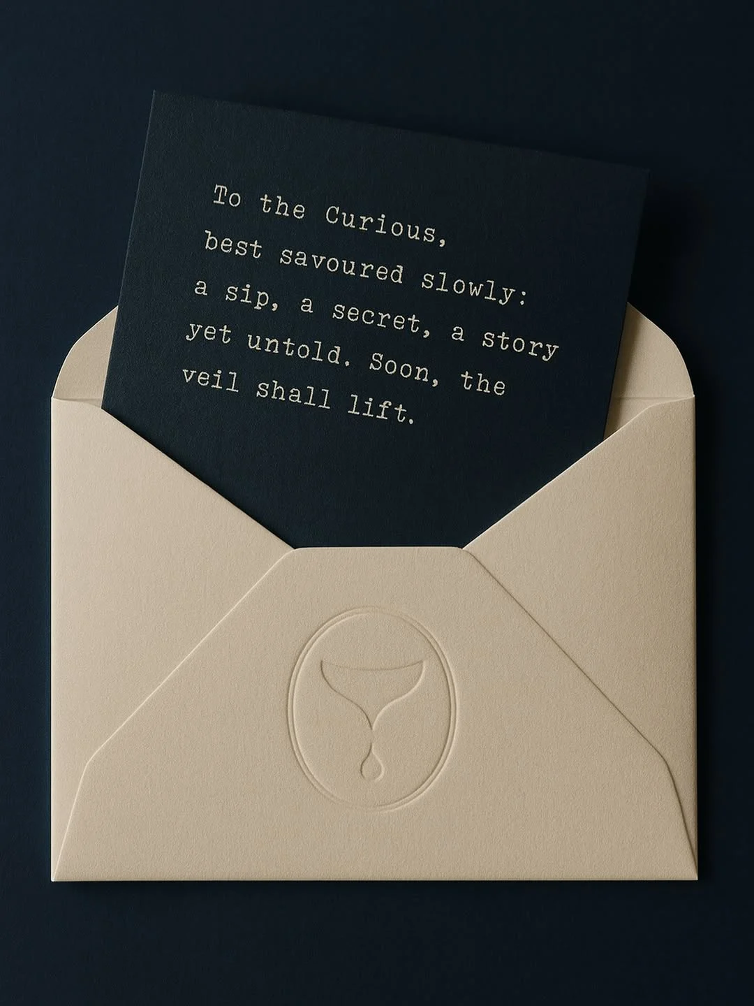
Because the space is so art-led, the identity borrows from it. Classical paintings become backdrops, the wordmark sits in antique frames, and menus are set like letters, sent in envelopes and sealed in wax. A sheet of vintage stickers, with cherubs, keys and ornaments, brings a little whimsy into the identity.
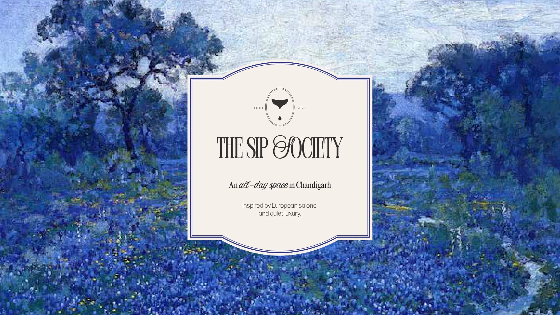
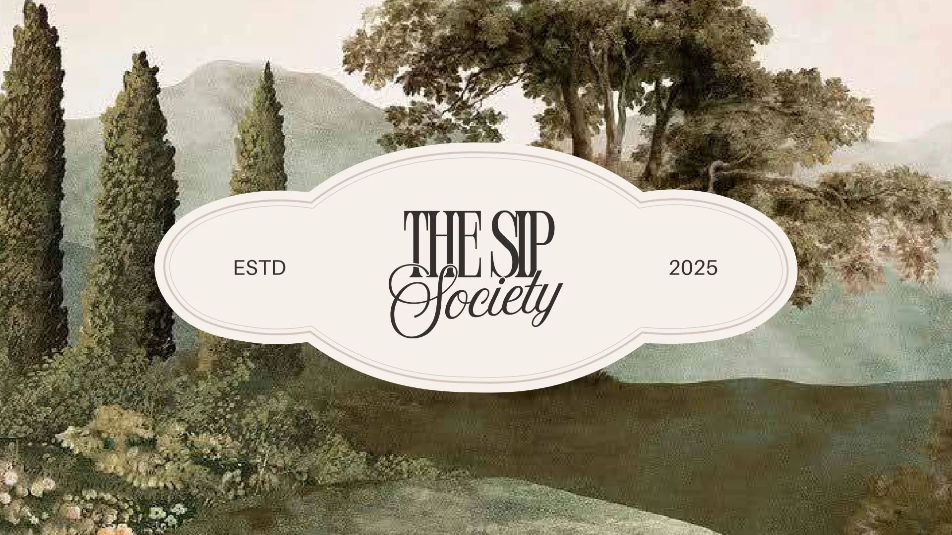
+ Frames over paintings“An all-day space in Chandigarh”
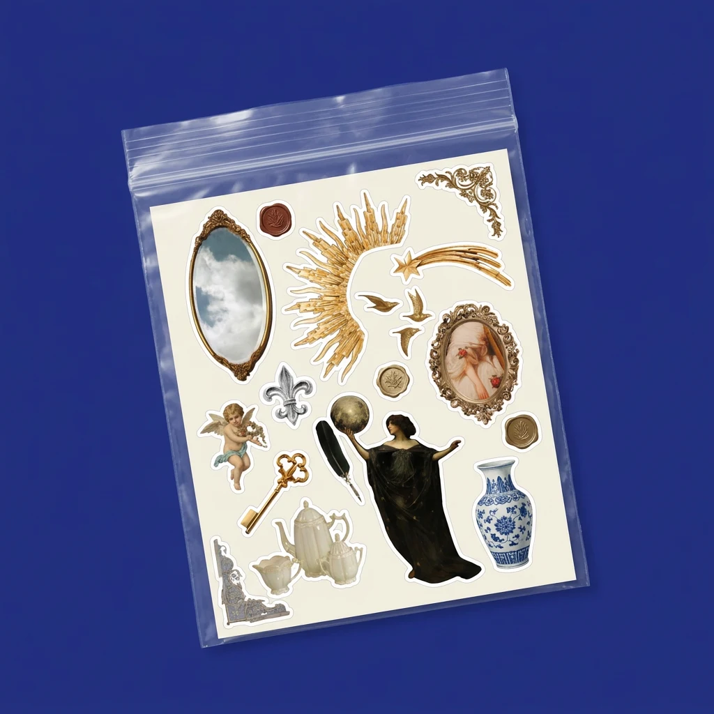
+ StickersAntique ornaments, cherubs and keys

+ InvitationSealed in gold wax
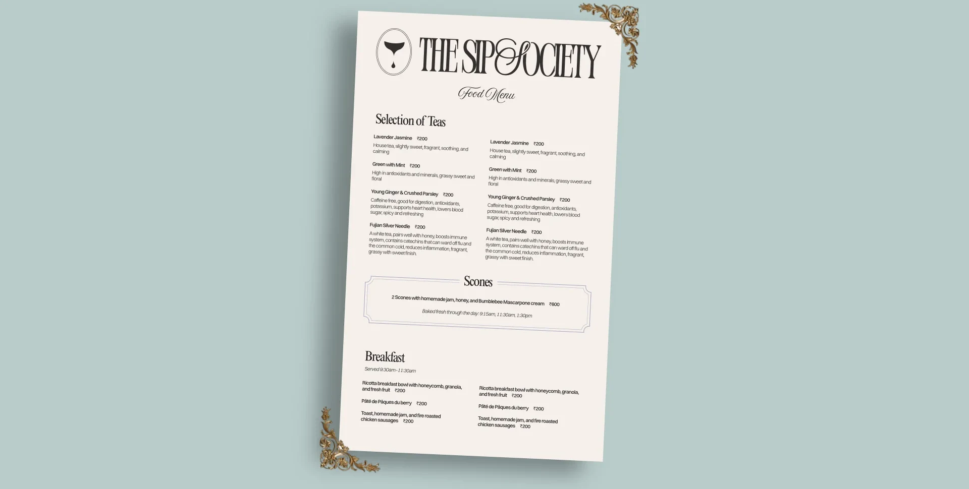
+ By day: the menuLight tones for the tea room
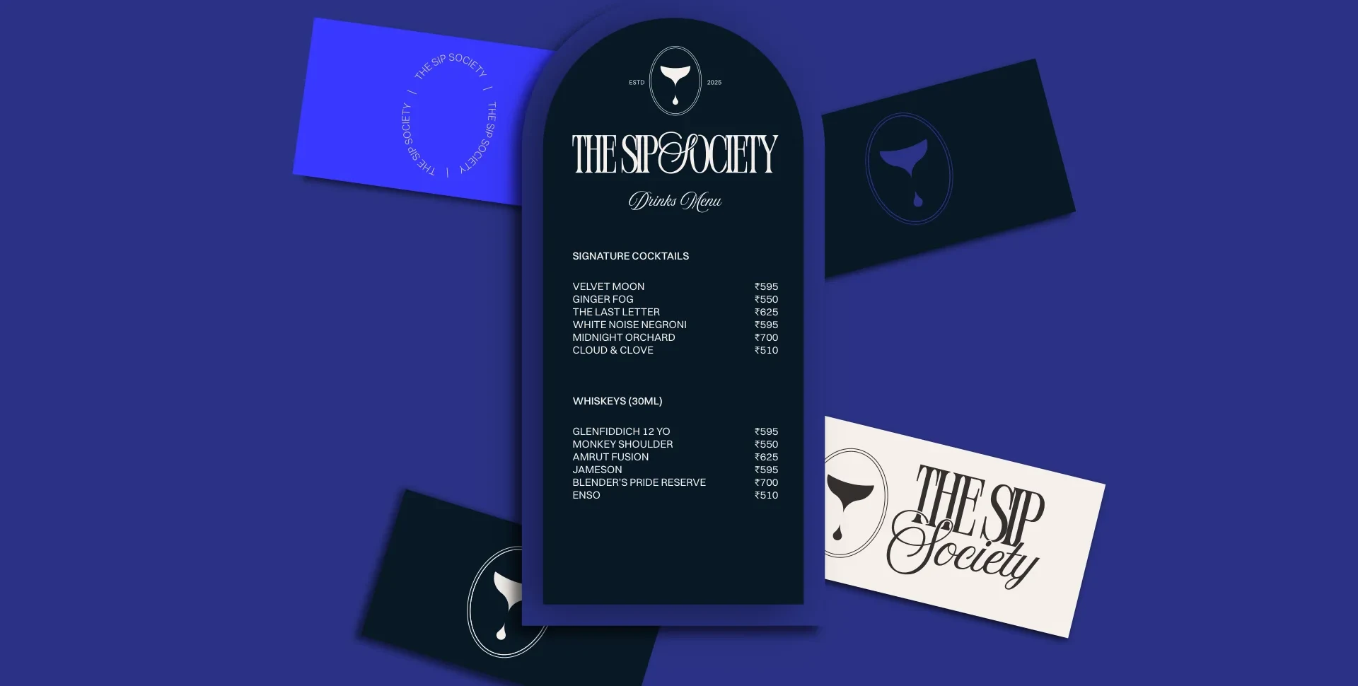
+ By night: the drinks listDeep tones, in an arch frame
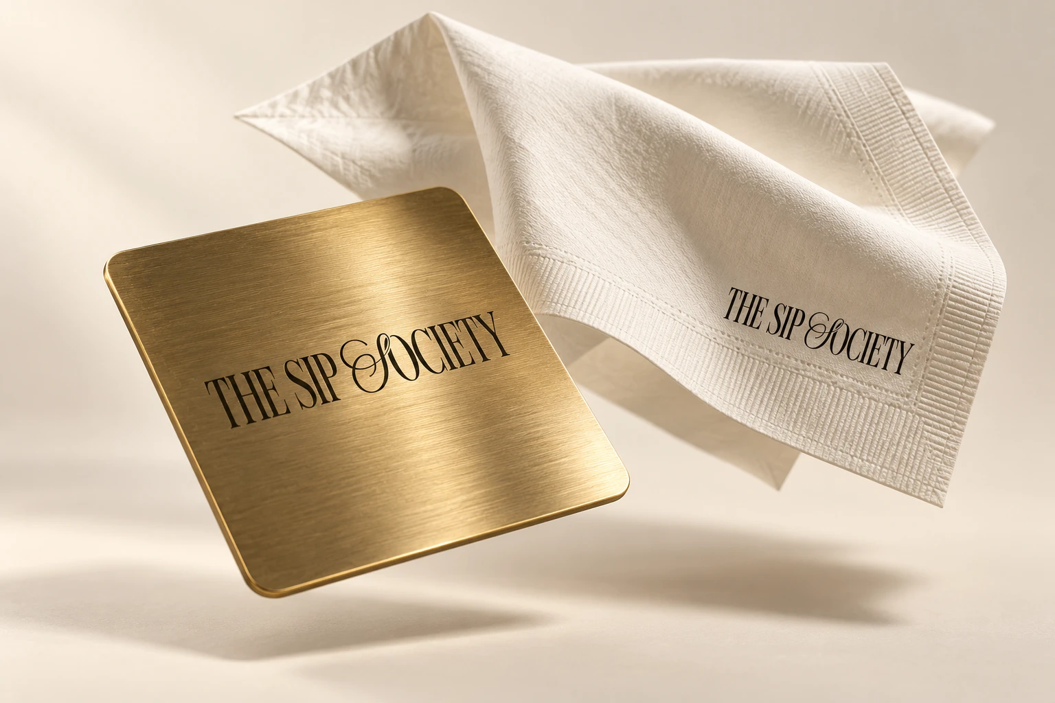
+ Coaster and napkinBrushed brass and linen
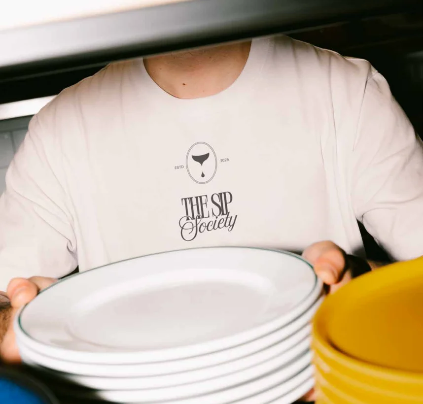
+ Staff, by dayThe stacked logo on a tee

+ Staff, by nightThe horizontal logo on a waistcoat
Across the table, and on the feed
The system runs through everything a guest touches: menus, coasters, takeaway, uniforms, invitations and stickers, all now in use at the venue.
I designed the social templates and launch content, and the identity has kept growing on the feed since, recognisable in every post.
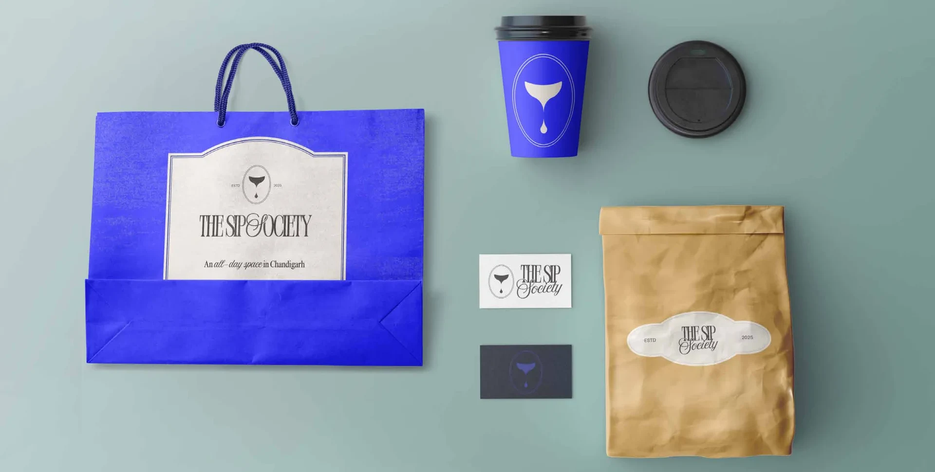
+ TakeawayCup, bag, pouch and card

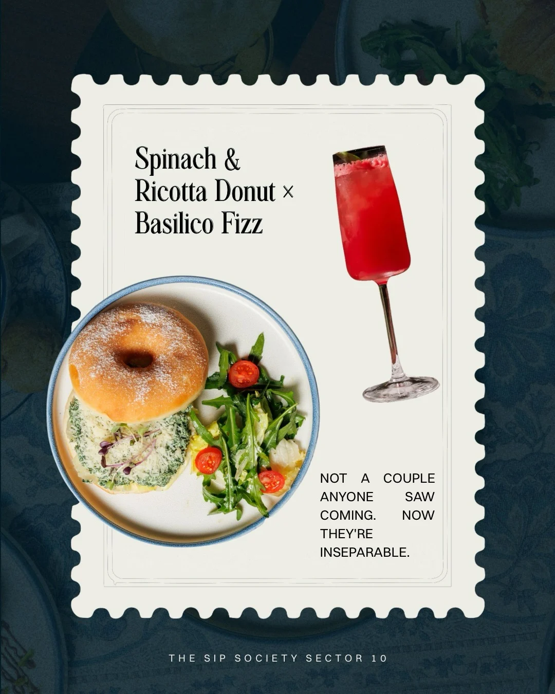
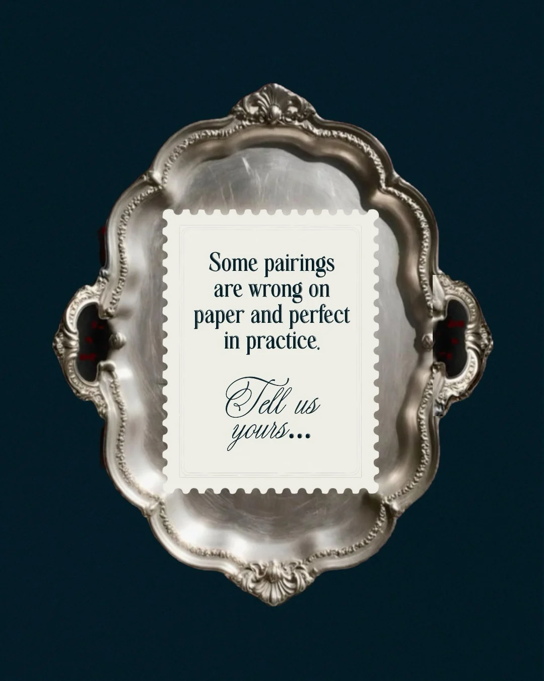

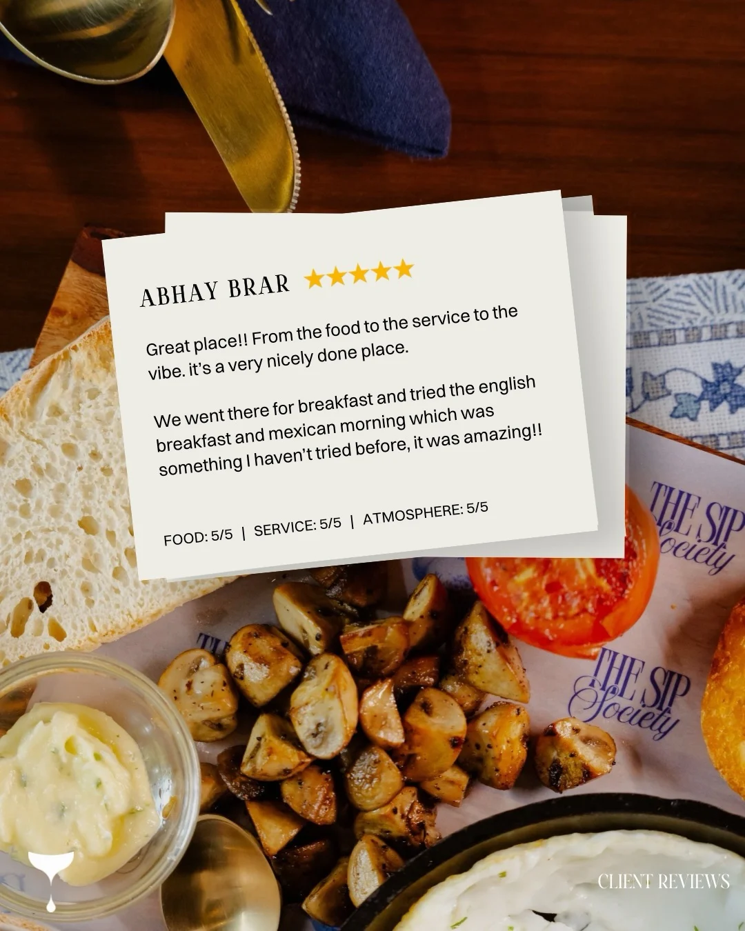
+ On the feedSocial templates in use
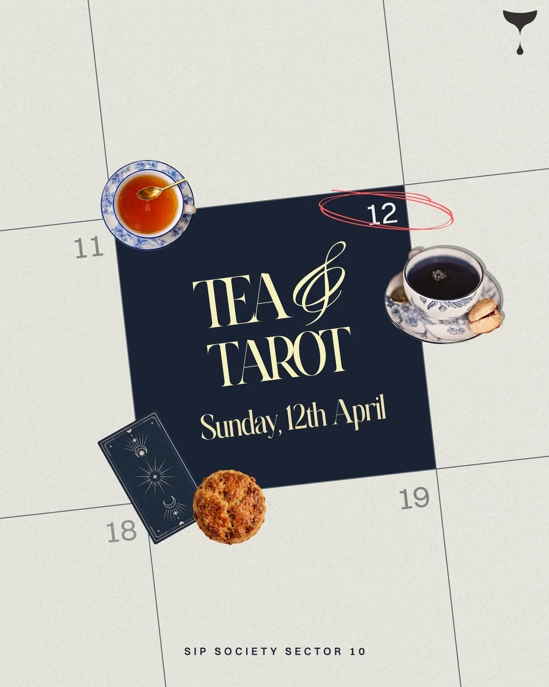
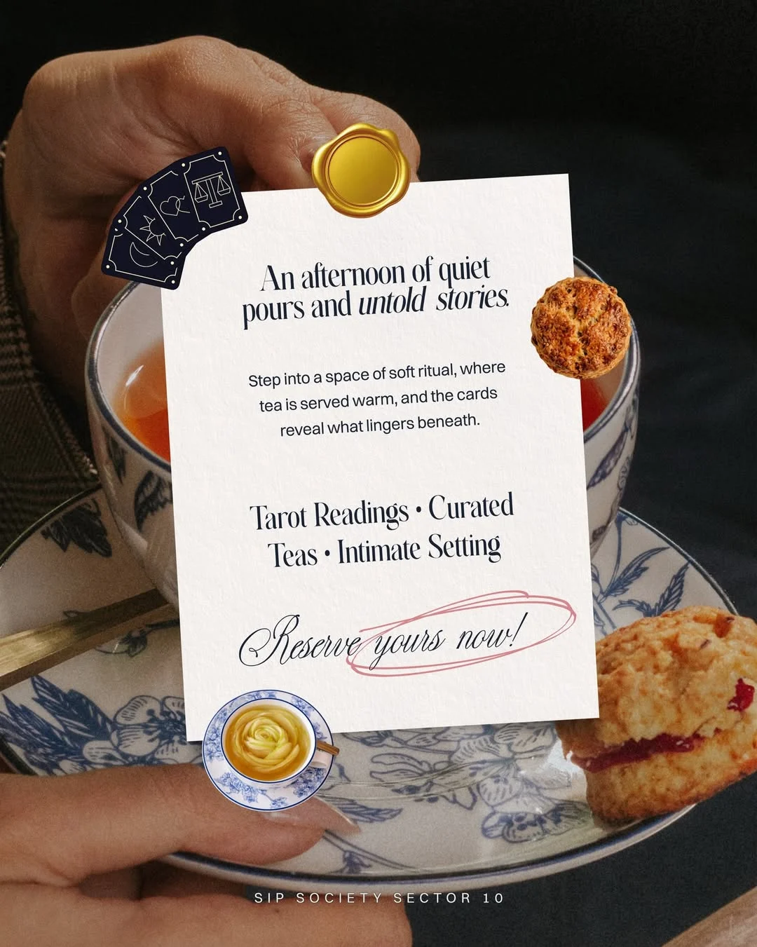
+ Tea & TarotAn event, in the brand’s voice
+ Launch filmSip differently
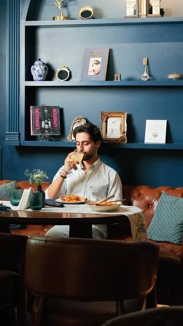
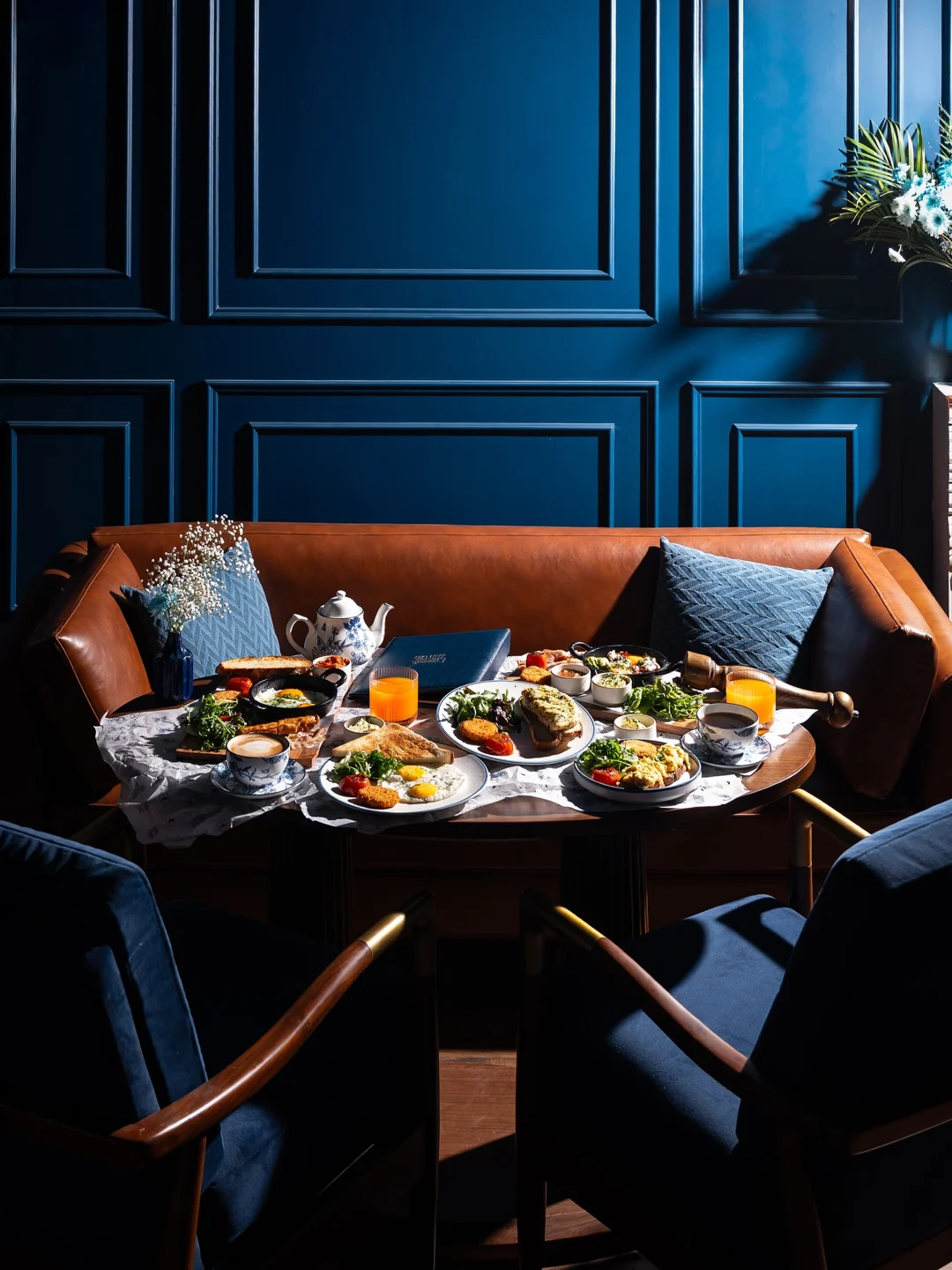
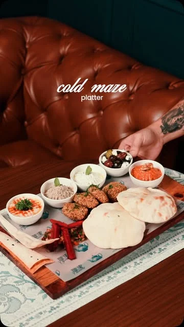
+ In the roomThe finished space · @thesipsociety.india