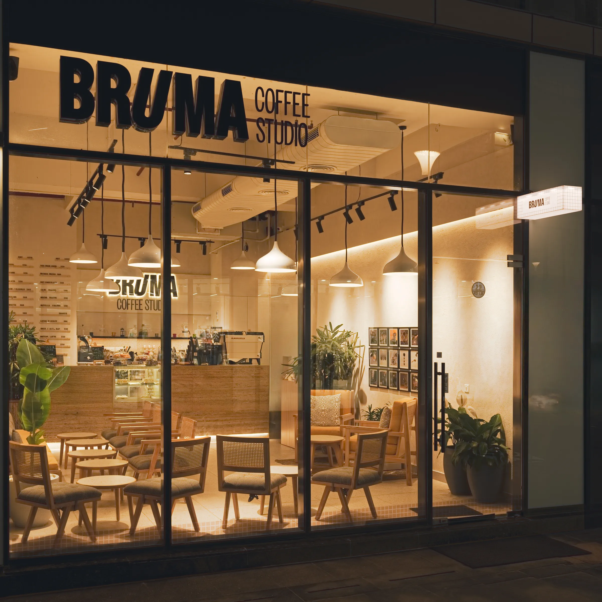
Bruma
A coffee studio for Gurugram’s growing coffee culture: young, warm and drawn by hand.
Bruma is a coffee studio in Gurugram. The founder wanted something young, made for the coffee culture growing across Gurugram and the NCR. I helped him settle on the name, then built the identity over several rounds: a bold wordmark, a warm palette, and a set of hand-drawn illustrations and stickers. The system carried across print, packaging, photography and social content.
A studio, not a café.
The founder wanted Bruma to reflect a considered approach to coffee: carefully sourced beans, specific roasts, different brewing methods and unusual drinks. “Coffee Studio” expressed that sense of craft and exploration. The identity needed to make it feel young and welcoming.
Early rounds were drawn for Bruma Café and Pâtisserie. We also weighed Bruma Coffee House before landing on Bruma Coffee Studio, a name that felt closer to craft. We refined the descriptor’s size and type, then settled on uppercase lockups that could work both stacked and horizontally. Removing a coffee-bean detail kept the wordmark cleaner.
+ Logo explorationsFrom Bruma Café and Pâtisserie to Bruma Coffee Studio
Bold type, warm colour.
The wordmark is a narrow, confident BRUMA with the U tilted out of line, a small slant that became the signature of the whole brand. It comes stacked, or side by side with Coffee Studio.
Yellow was the founder’s favourite, so I gave it a clear role in the identity: Sunset Gold across key applications, with yellow hand-drawn accents over photography. Vanilla and a coffee-brown Charcoal give the brighter colours room to stand out.
Owners X Narrow sets the headlines. Just like the U in the logo, one or two letters in each heading are italicised. Aminute adds a few curvy glyphs for fun, and Owners carries the body.
+ Primary logoBruma with Coffee Studio below
+ Logo familyPrimary above, secondary below
3F3A38 · 25%E9E3E0 · 25%E79B35 · 15%FF5800 · 10%417ABD · 10%816C24 · 5%FFBF3B · 5%85BAFF · 5%+ Colour paletteSized by the usage ratio in the guidelines
+ Owners X NarrowOne italic letter at a time
+ AminuteCurvy glyphs, used sparingly
+ OwnersLight to bold, for everything you read
+ Type hierarchyFrom the brand guidelines
+ PatternsCheck and halftone
Drawn by hand.
Coming from an art background, I brought hand-drawn elements into the identity.
Every illustration, character and sticker was drawn by hand for Bruma, first in line and then in colour, from moka pots and croissants to a small cast of coffee characters. The stickers are handed out to guests.
To build recognition, I proposed keeping the coffee cup at the centre of a small cast of characters. Food drawings, check and halftone patterns support them, rather than giving every illustration equal weight.


+ Sticker sheetHand-drawn characters and bakes, cut as stickers

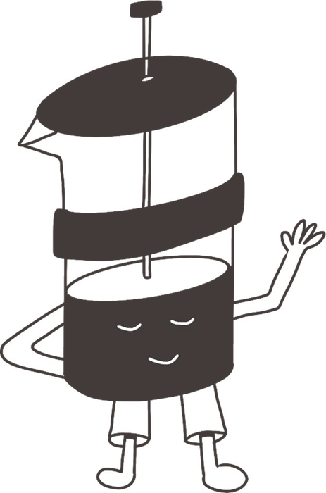

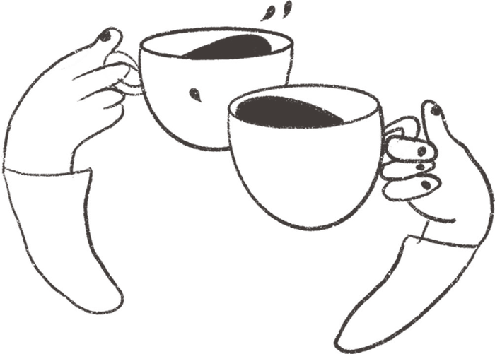
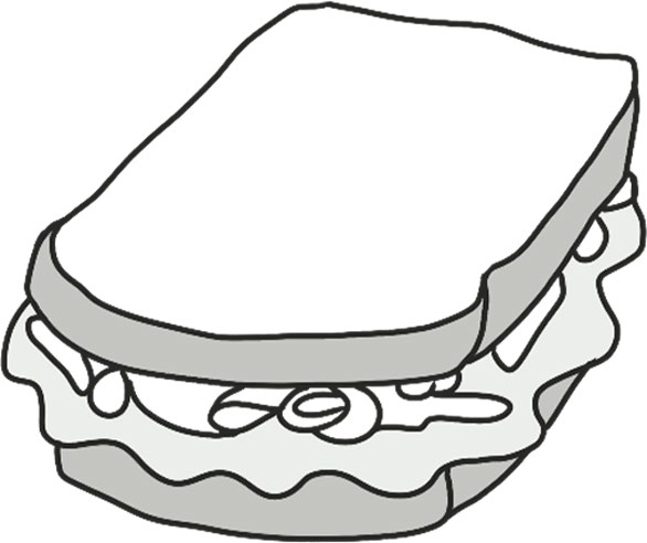
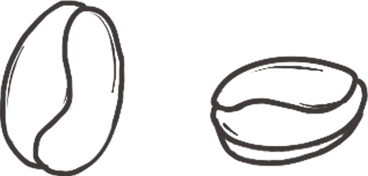
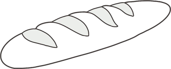

+ Line illustrations and charactersDrawn by hand, before colour
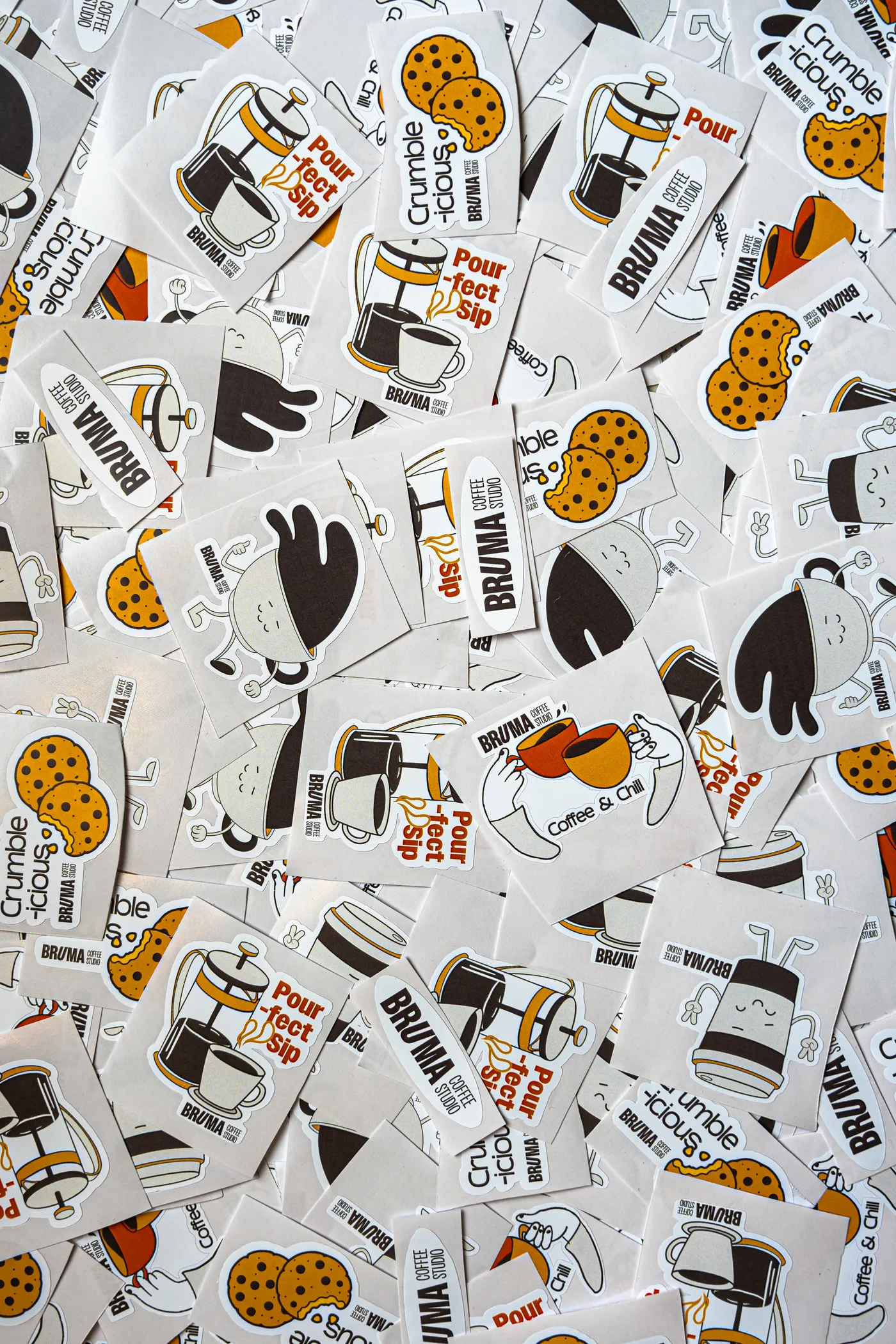
+ StickersThe printed set

+ Kids of BrumaStickers handed out to guests
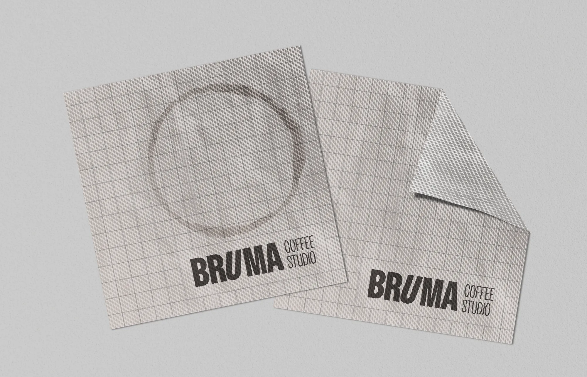
+ NapkinsThe check pattern in use
From the counter to the bag.
Off screen, the identity moved onto menus, cups, coasters, napkins and kraft packaging.
The hand-drawn illustrations and stickers carry onto the packaging too: stars and beans on the coasters, a cookie on the dessert bags and a baguette on its sleeve.
The playful copy carries through the packaging. Colour choices also had to work on the material: when yellow lacked contrast on the coasters, I recommended darker options.
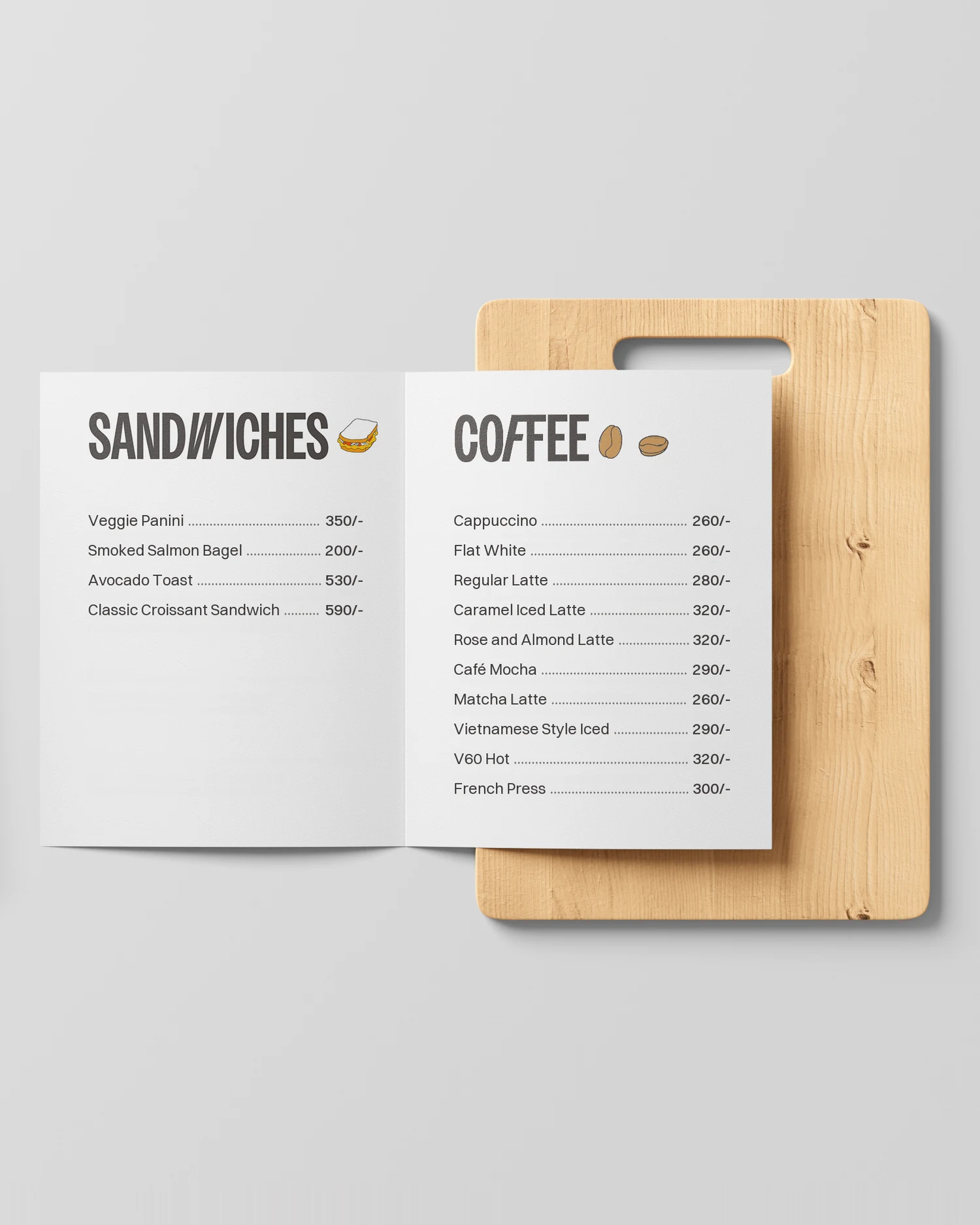
+ Menu, by dayFood and coffee, with the illustrations as icons
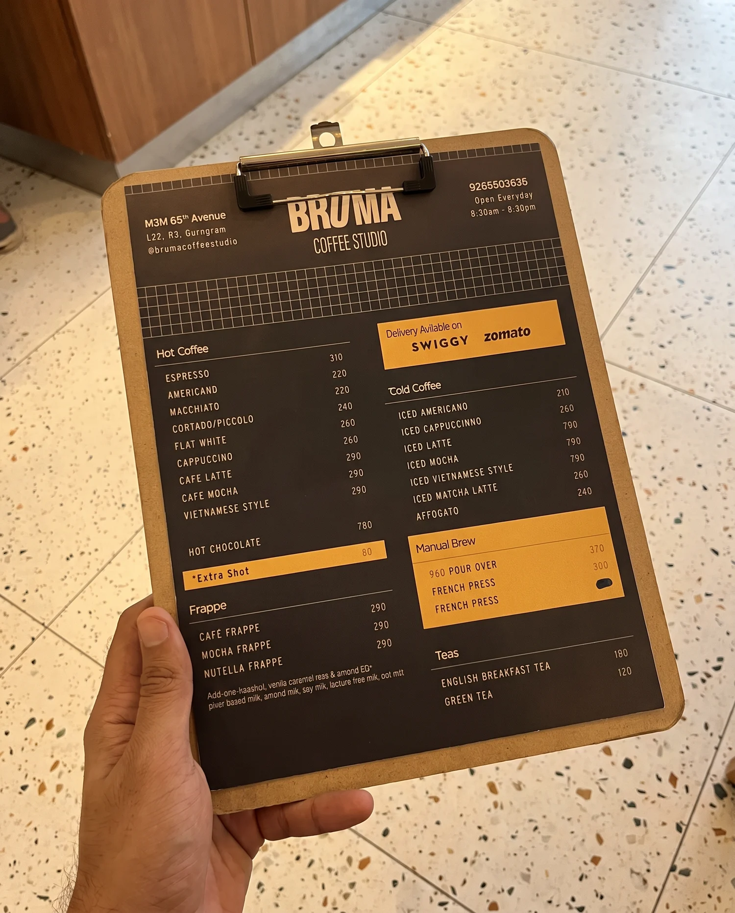
+ Menu, by nightCharcoal, with Sunset Gold panels


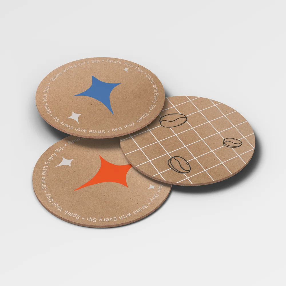
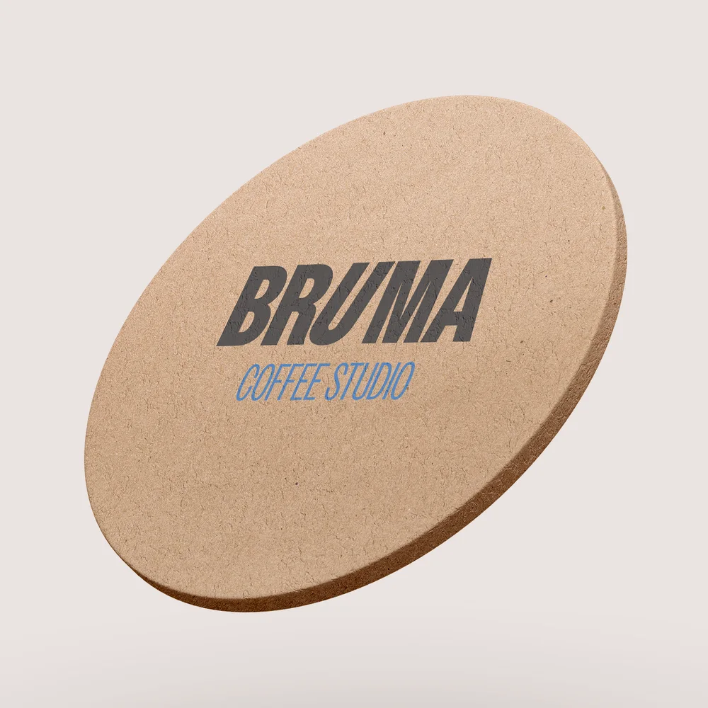
+ Cups and coasters8oz kraft, 12oz clear, coaster front and back
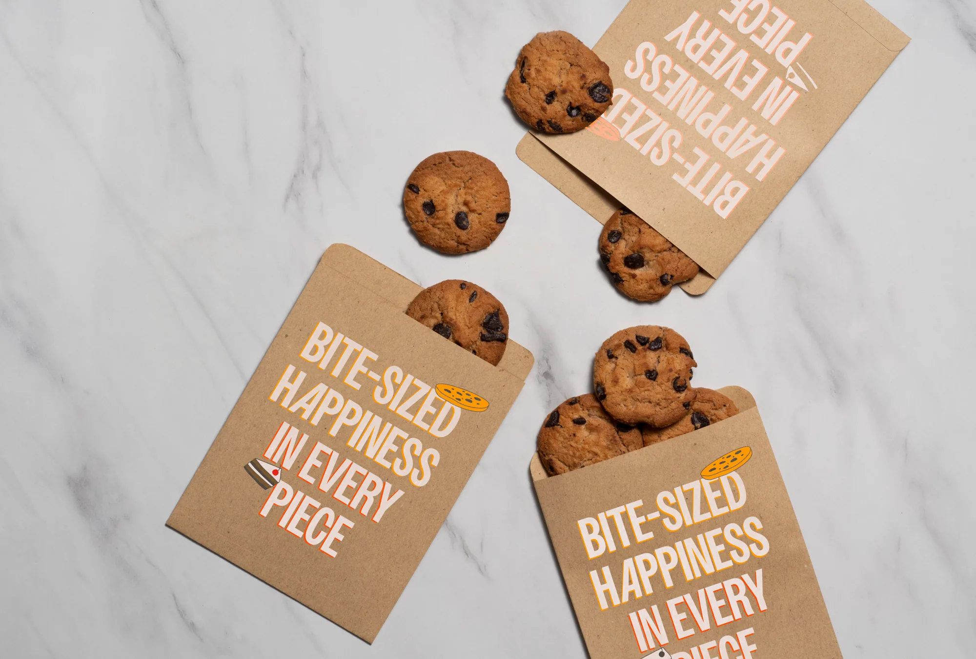
+ Dessert bagsThe cookie and cake illustrations, on kraft
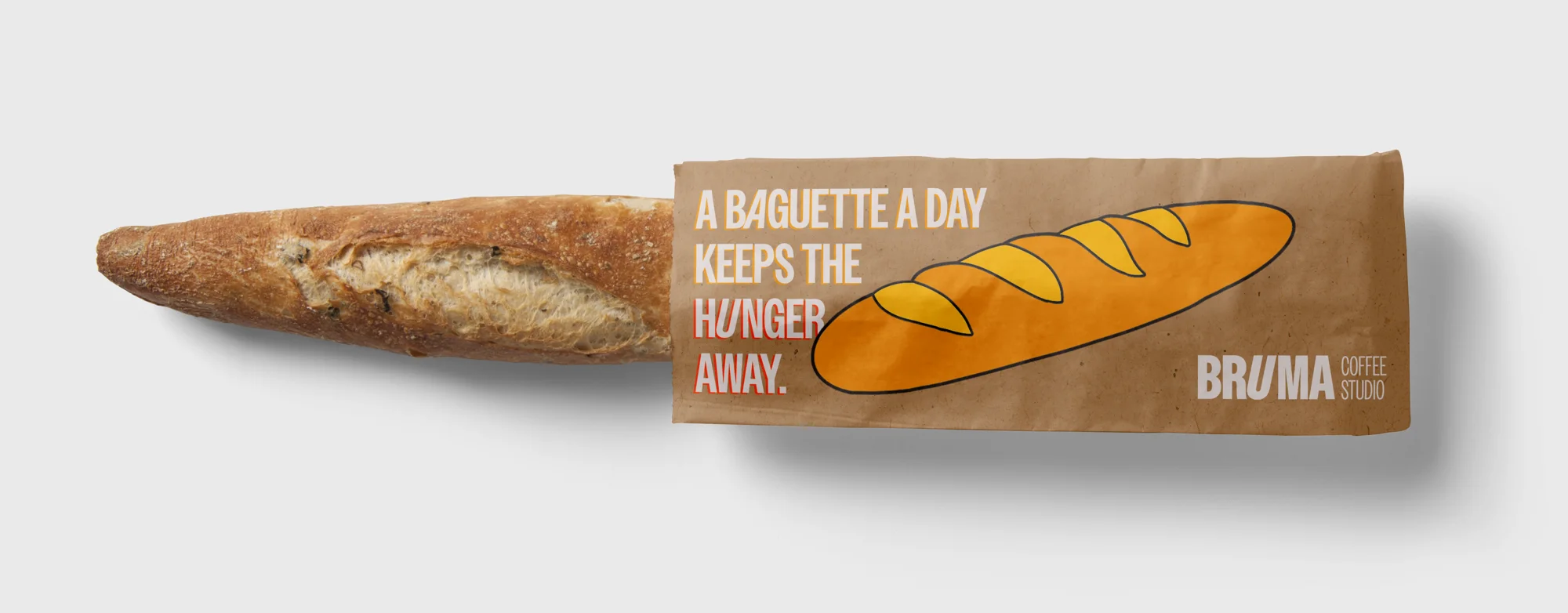
+ Baguette bagThe baguette illustration, on its own sleeve
On set.
The brand carried into photography of the studio, coffee and food, the team in uniform and packaging in hand. Yellow hand-drawn overlays connect the photographs back to the illustration system.
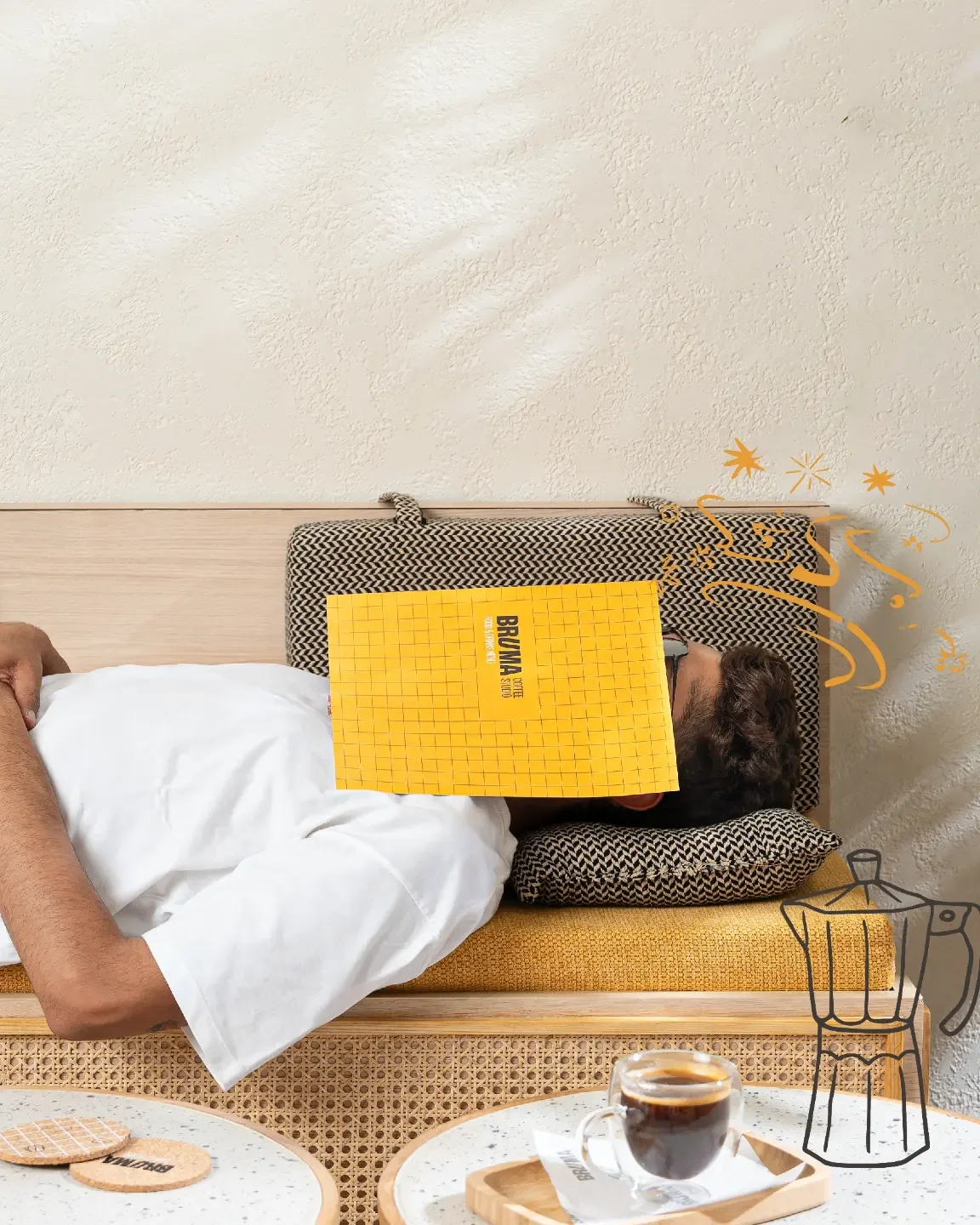
+ The hangover fixThe menu, put to good use
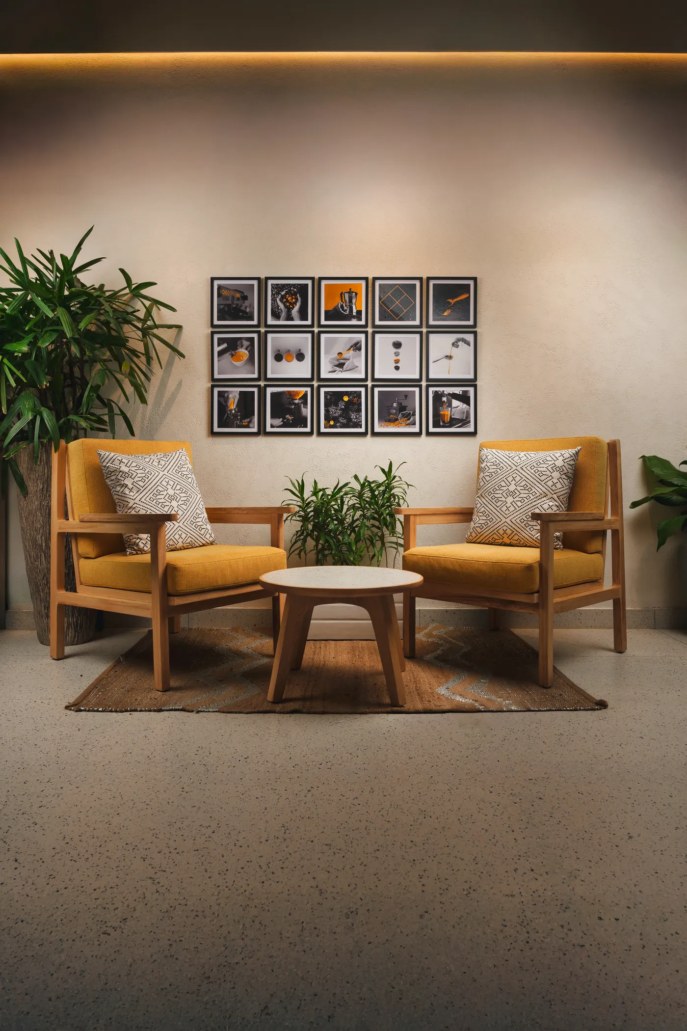
+ The loungeFramed prints and mustard armchairs
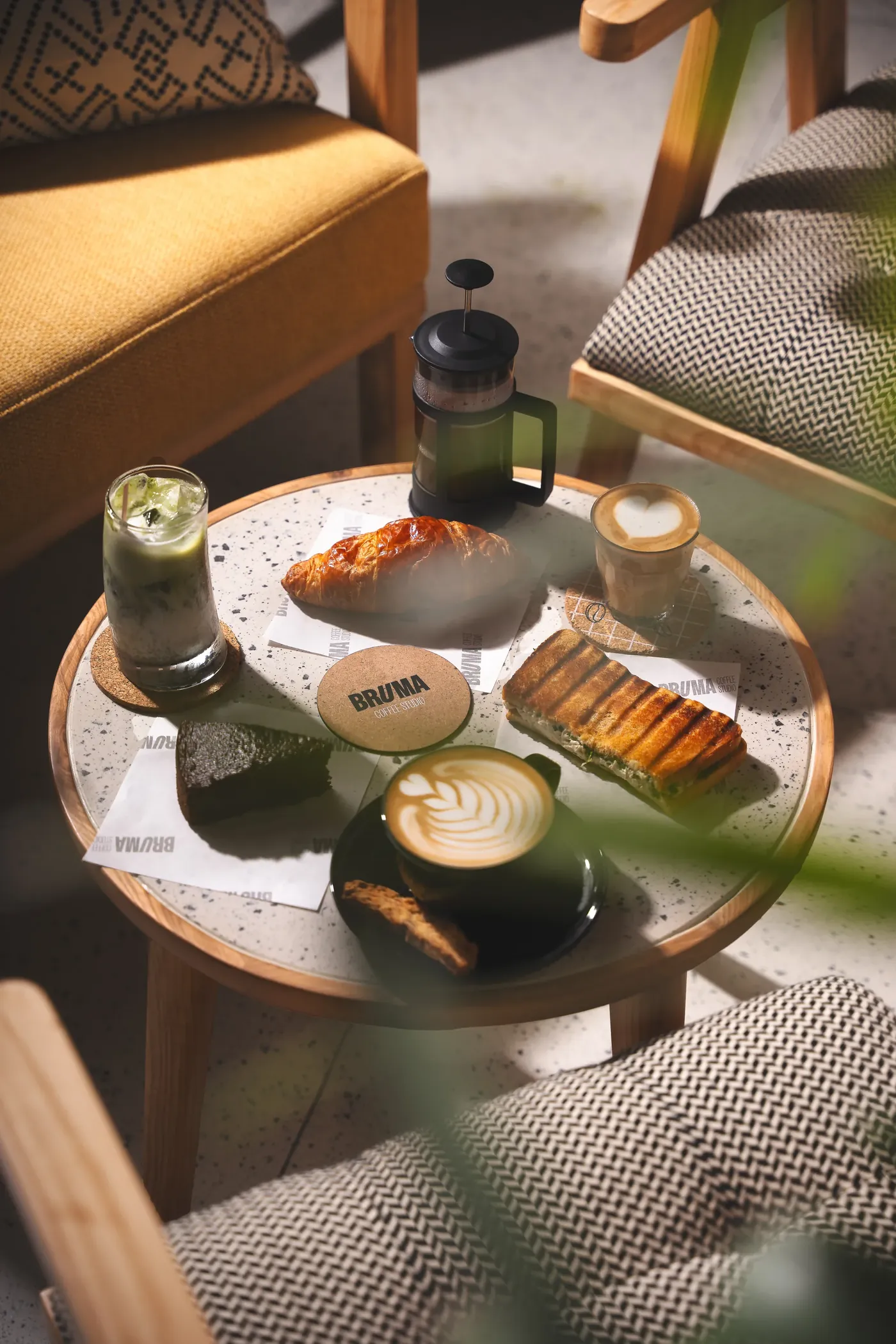
+ At the tableCoffee and pastries
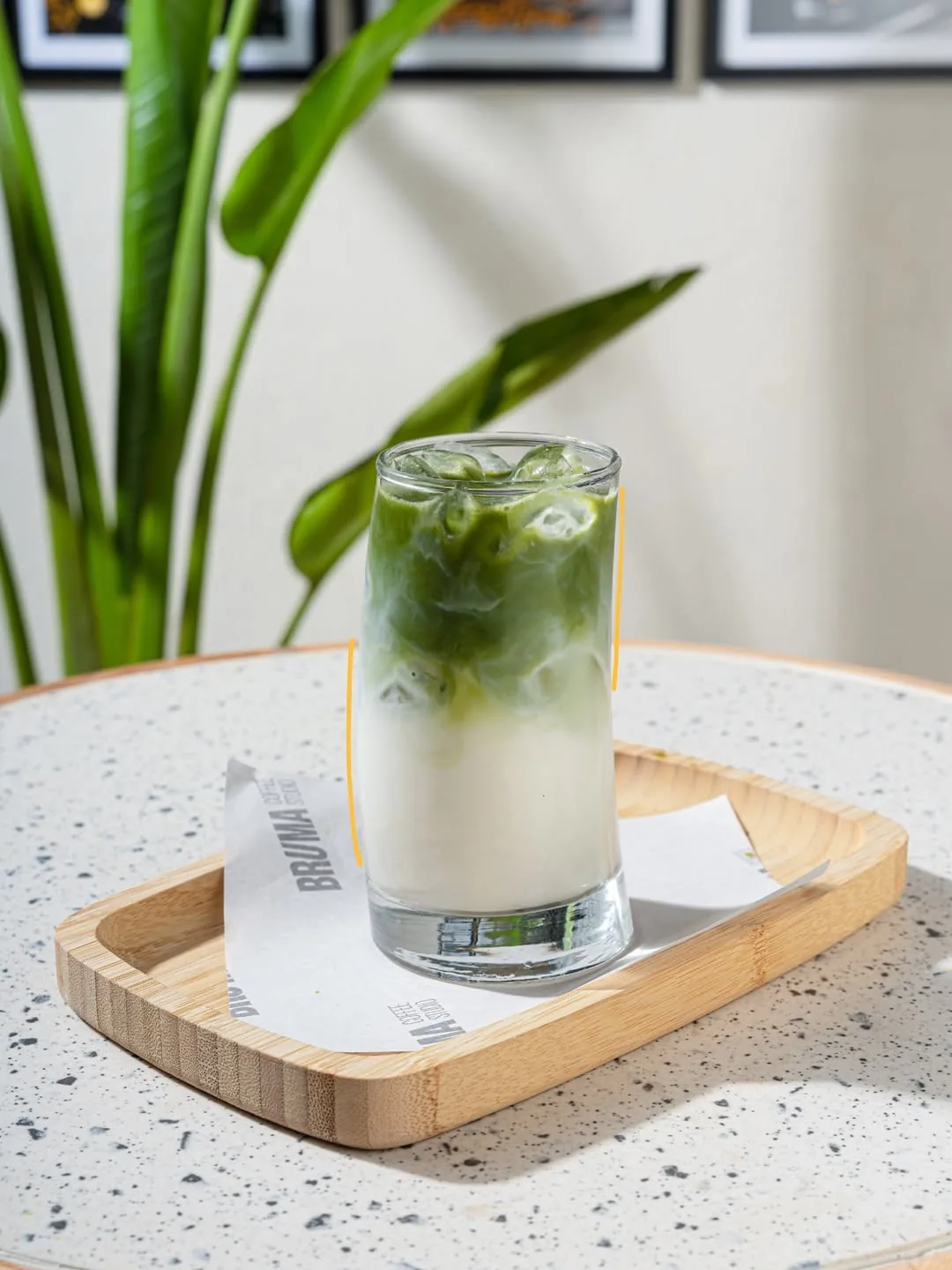
+ MatchaMondays are for matcha
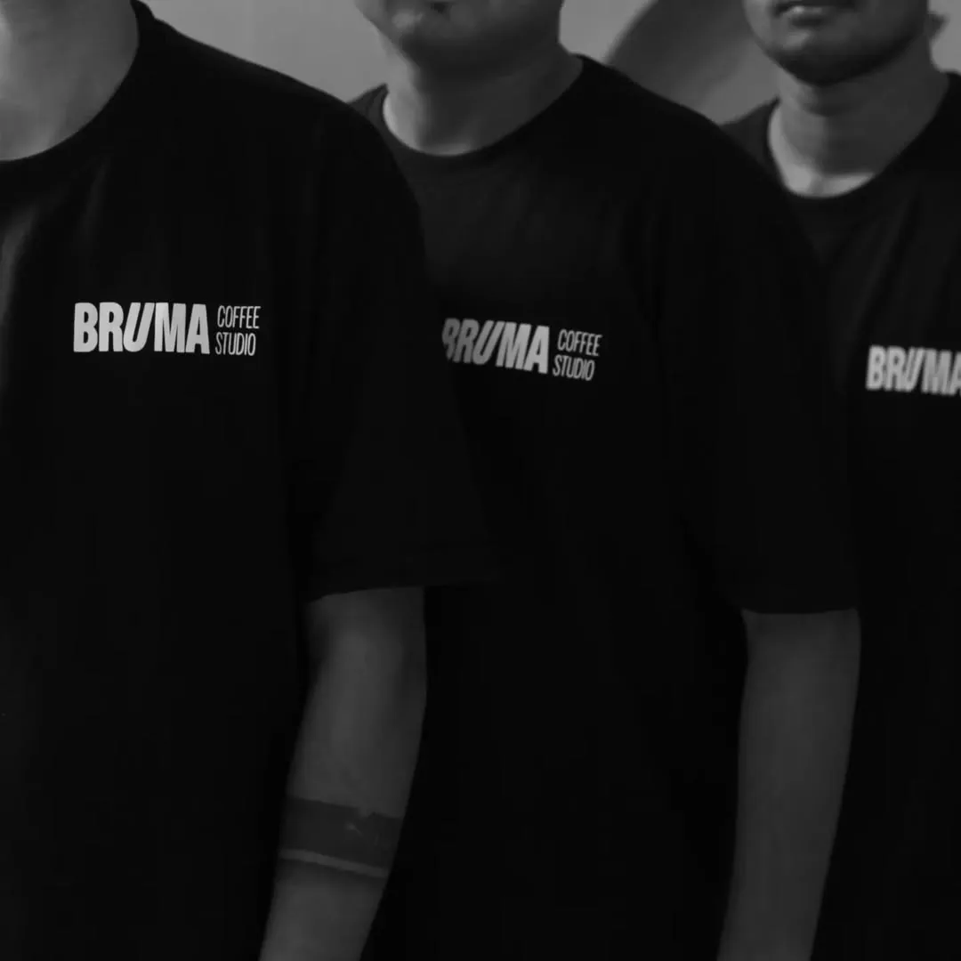
+ The teamIn Bruma tees
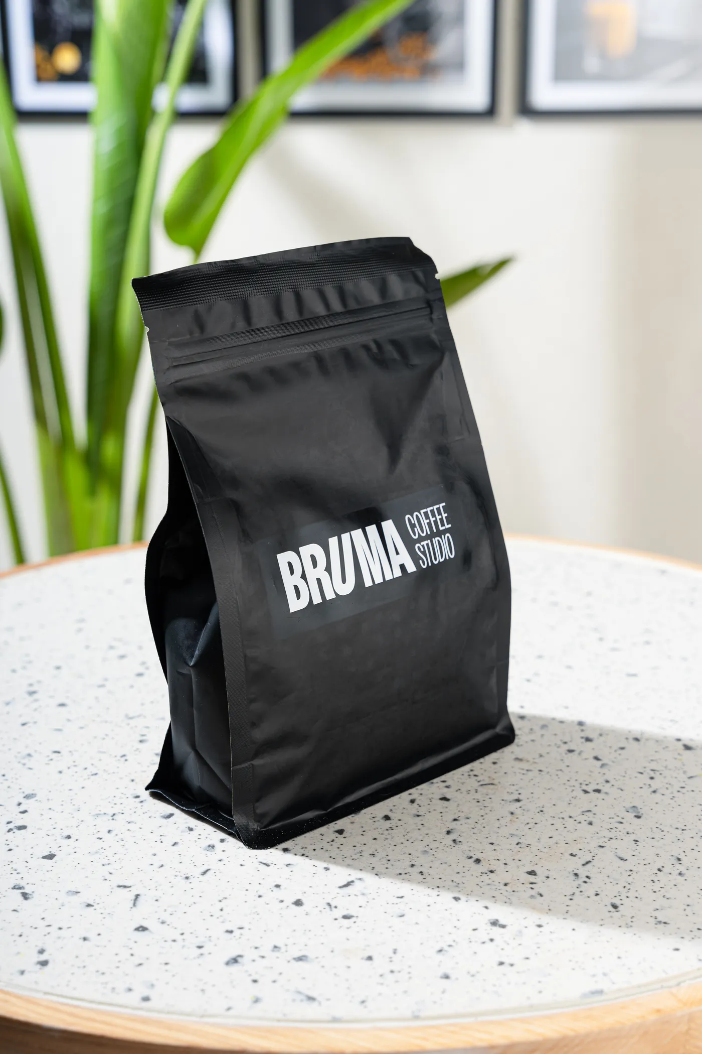
+ Coffee beansThe bean bag
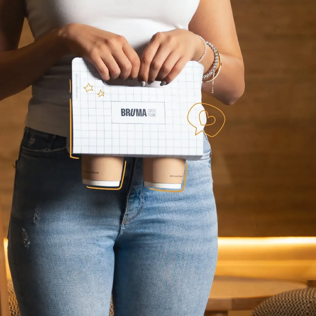
+ DeliveryThe carrier in check
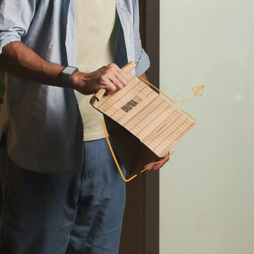
+ HandoverSwiggy and Zomato orders
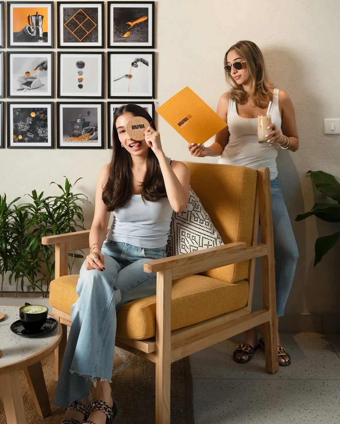
+ GuestsIn the lounge
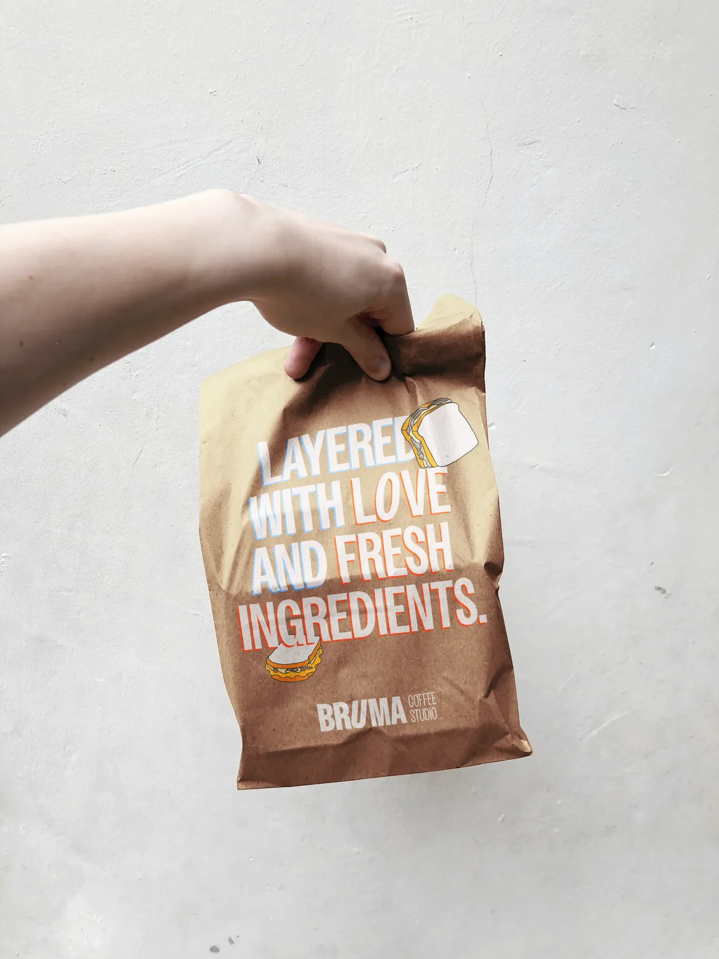
+ Sandwich bagLayered with love and fresh ingredients
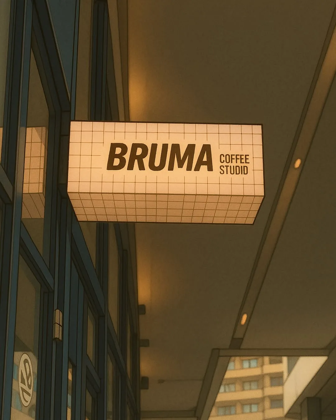
+ The signA light box in the check pattern
On the feed.
On Instagram the system loosened up: opening nights, a loyalty card, coffee-date calendars, delivery pushes and short reels, all in the same colours and type.
Yellow hand-drawn overlays bring the illustrations into photographs of the space, people and products. Tangerine adds another accent, while the tone stays light and conversational.
+ OpeningOpening night, menu and timings
+ Illustration and typePosts built from the hand-drawn set
+ PostsStatics from the feed
+ The capsuleA playful product render
+ Brewing memoriesGuests at the studio
+ ReelsThe identity in motion