Royal Enfield / JATH
JATH is Royal Enfield’s festival at Travancore Palace in New Delhi, and the Himalayan Bazaar is its retail space, where makers from across the Himalayas sell under one roof. With Moondust, I led the first week of concept work, from moodboards to a locked direction and the first floor plans, before the visual merchandising team took it into build.
Thirty-three boards before the first review.
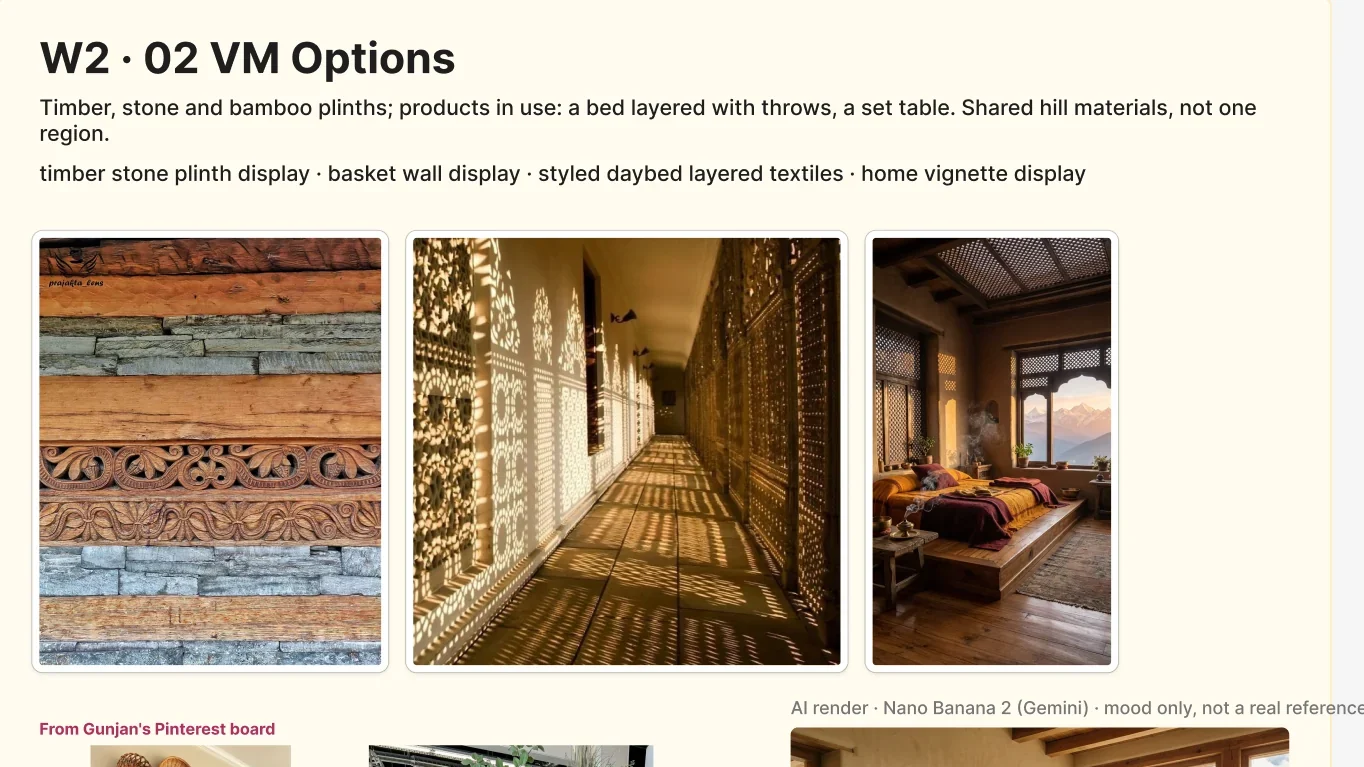
I started with last year’s bazaar, photo by photo: what to keep and what to fix. Then I broke the brief into eleven questions every world had to answer, from the category intro and back wall to mannequins, mirrors and wayfinding, and answered them three times.
Each board mixed the team’s Pinterest references with AI renders, labelled as mood only.

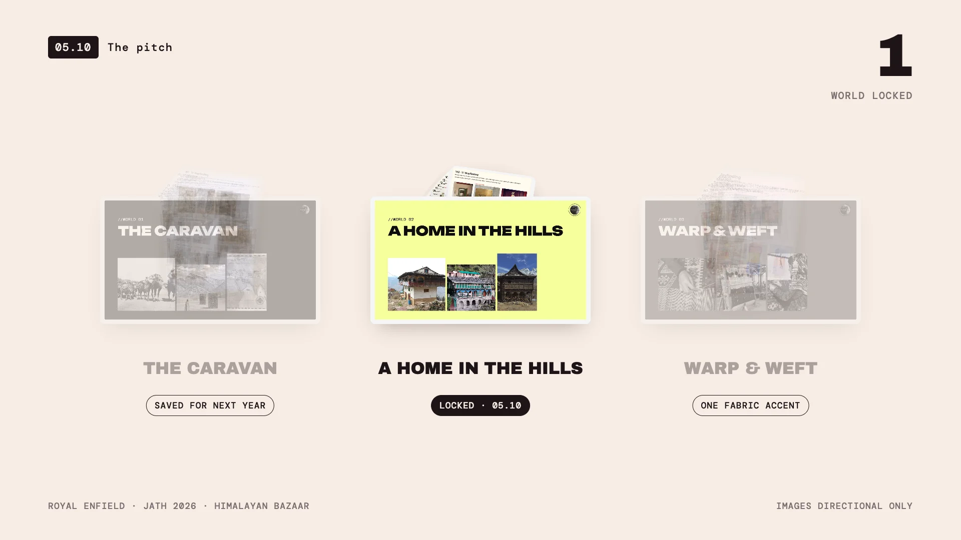
Three worlds, one review.
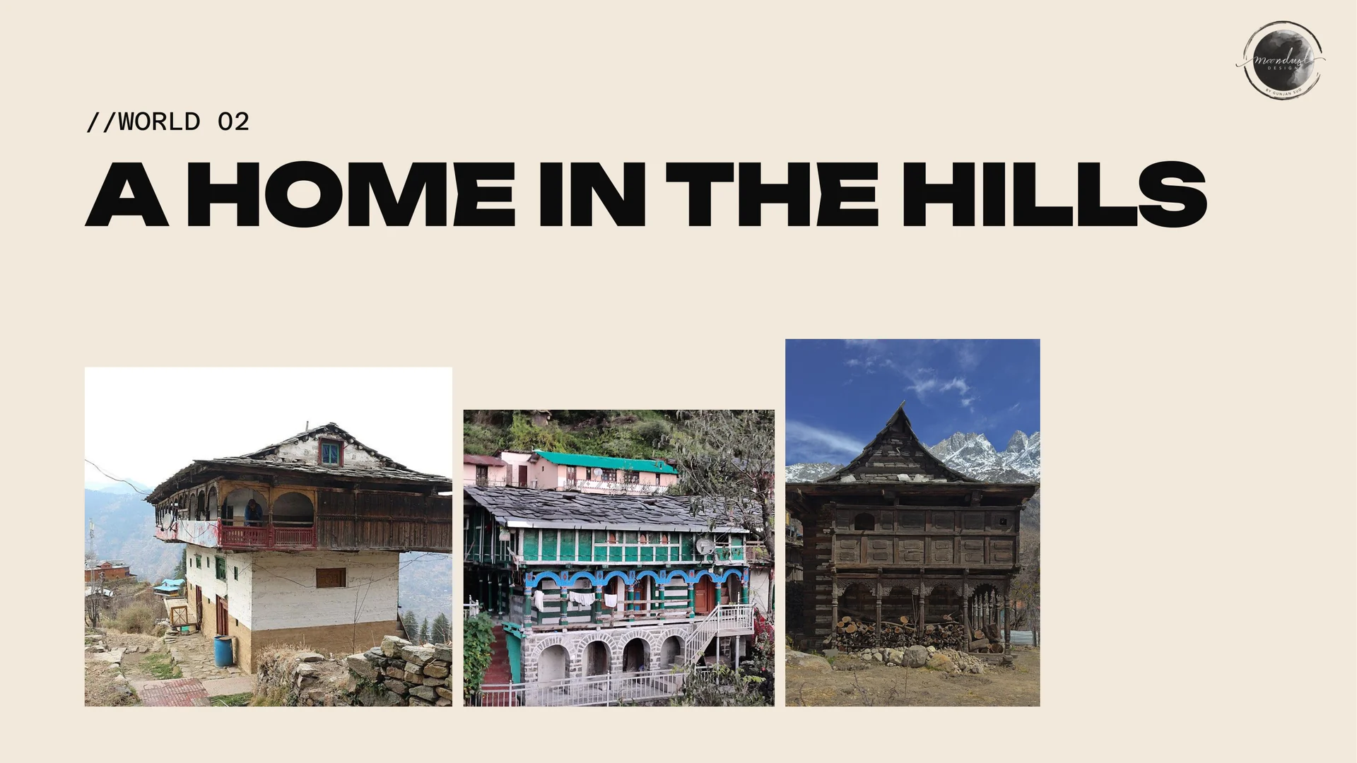
The Caravan imagined the bazaar as a Silk Route trade camp. A Home in the Hills gave every maker a room of their own. Warp & Weft followed a shawl from a single dye colour to finished pattern.
At the review on 5 October, the client locked A Home in the Hills. The Caravan’s bamboo structure was saved for a future edition, and Warp & Weft became one fabric accent.
Zones first.
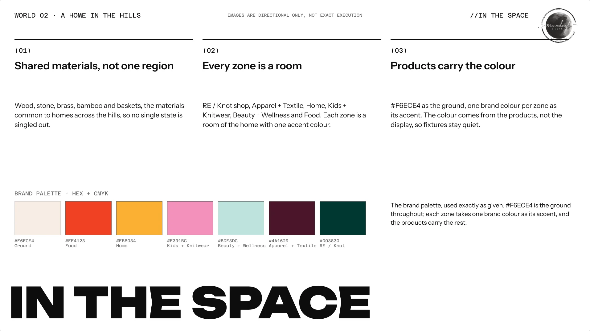
Two days later I rebuilt the deck around the floor rather than the mood: six zones around the U, each a room of the home, each with one brand colour as its accent. The colour comes from the products, so the fixtures stay quiet.
Numbering the rooms in walking order, from the RE shop to Food, made the route part of the plan.
The courtyard, two ways.
The next round zoomed into the courtyard, the one space every visitor crosses. Two layouts placed the RE bike, a grazing table, the Warp & Weft screens and chaupal seating, keeping a clear walk from the entry into Home.
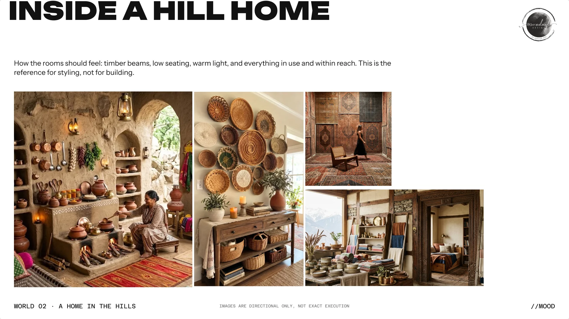
A mood page set how every room should feel: timber, low seating, warm light, everything within reach. It was a styling reference, not a build drawing.
What I took from it
A week is enough to set a direction when every round answers the last review. Three worlds became one home, the home became six rooms, and the rooms became a courtyard plan the visual merchandising team could build from.
Every image here is directional, made to decide, not to build.