Pernod Ricard India
Pernod Ricard India’s 30-year anniversary and national conference. I led the 2D art direction, from the THIRTY identity to the stage, the walls and the street outside.
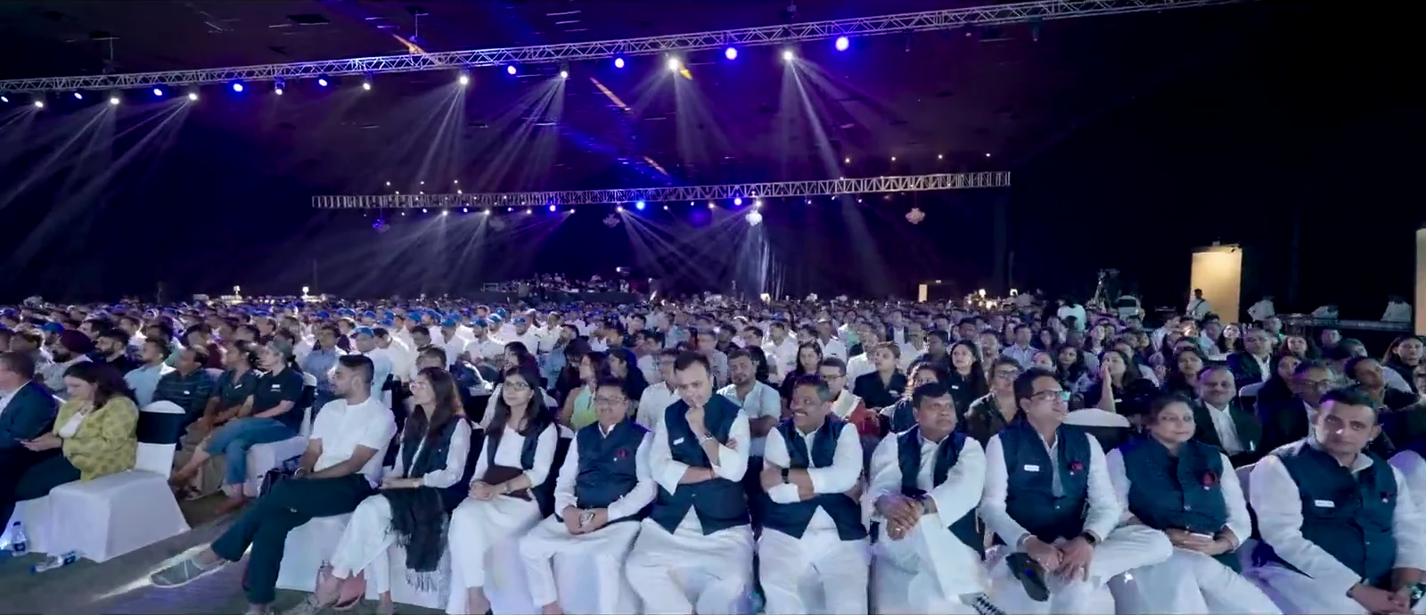
- 1,500+attendees
- 2days
- 10+bar takeovers
- 15+performances
+ The event in numbersReported by White Media Marketing
One mark for thirty years
The anniversary needed one mark that could hold thirty years and point to what comes next. I designed THIRTY around PRI’s own line, great 30, greater 2030, with a gold ribbon running through the wordmark.
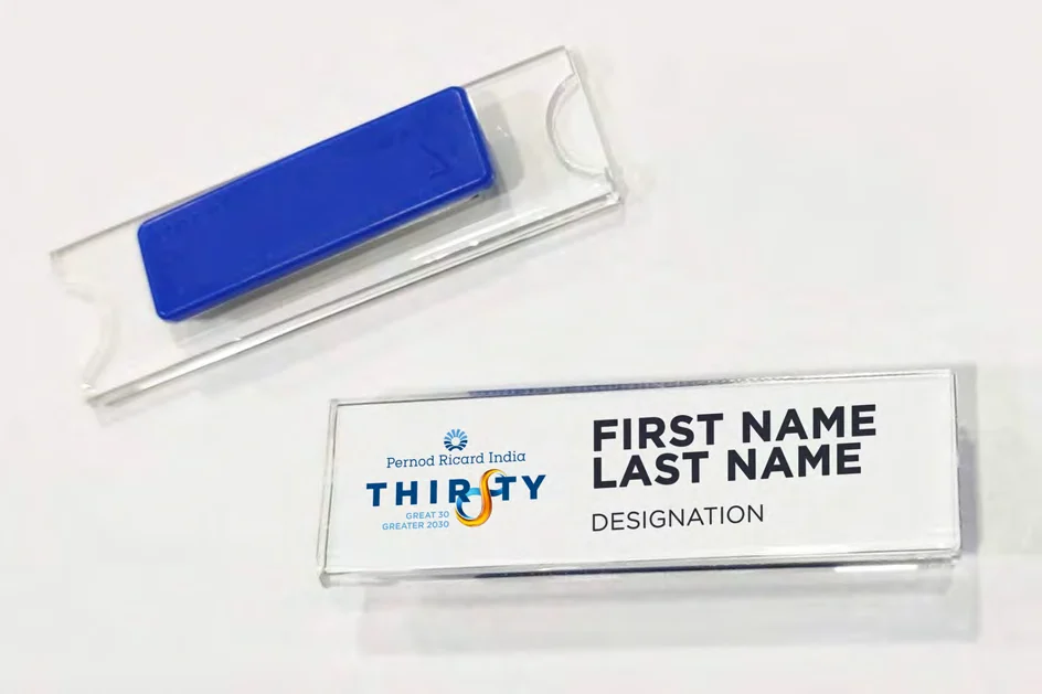
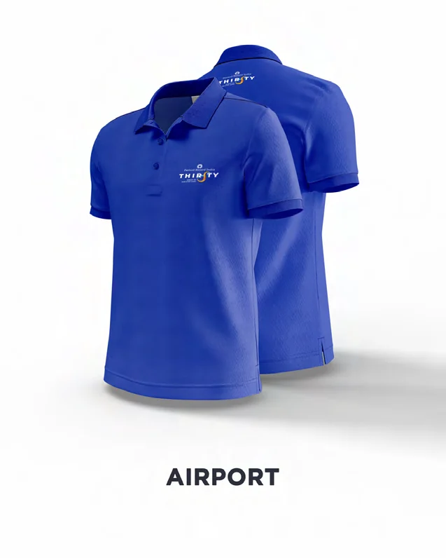
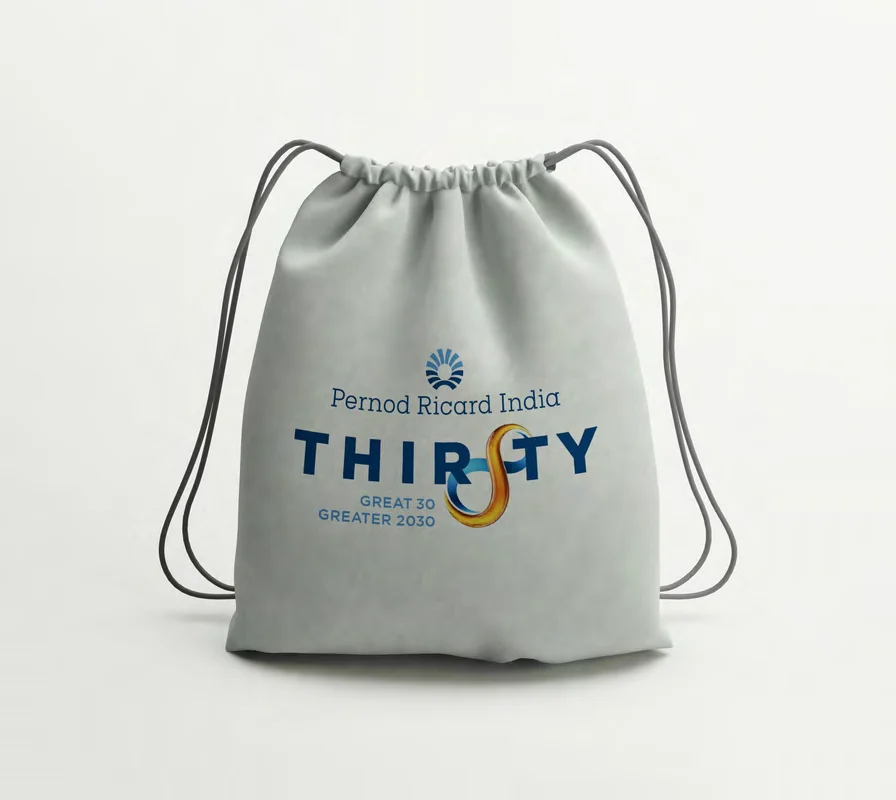
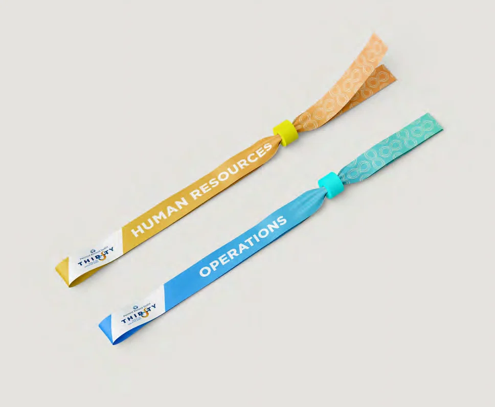
It came in a light and a dark version, for daylight signage and a night stage. From there it went on everything a guest held or passed: the welcome placard, wayfinding, badges, lanyards, uniforms and bags.


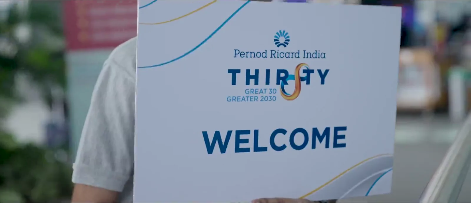
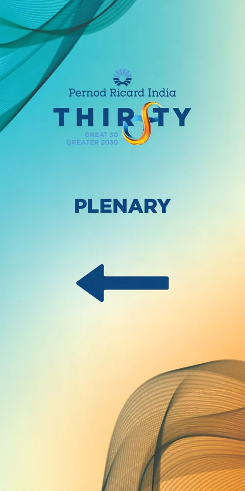


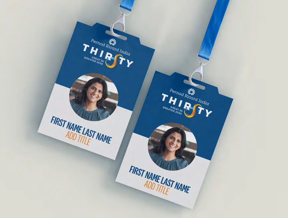
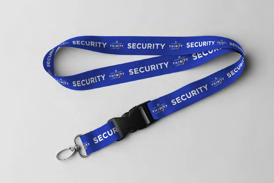
The key visual, at stage scale
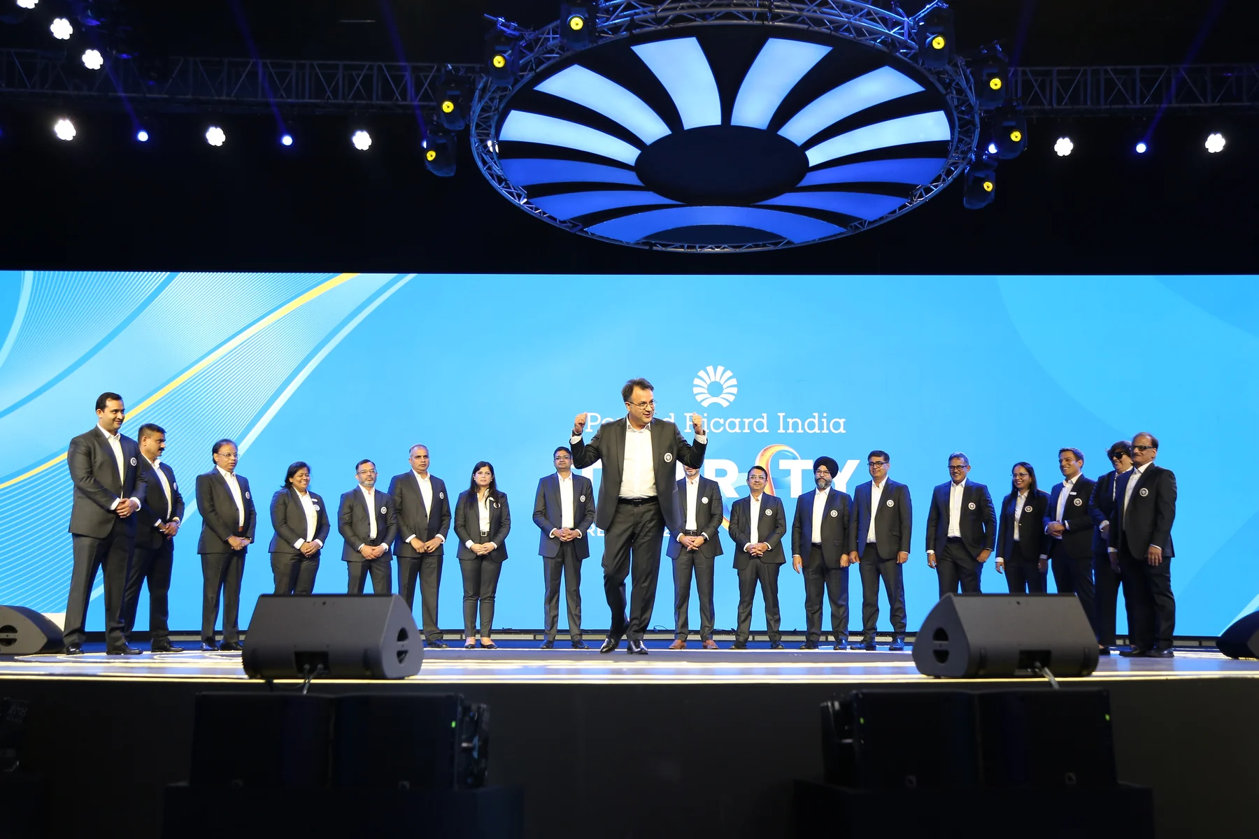
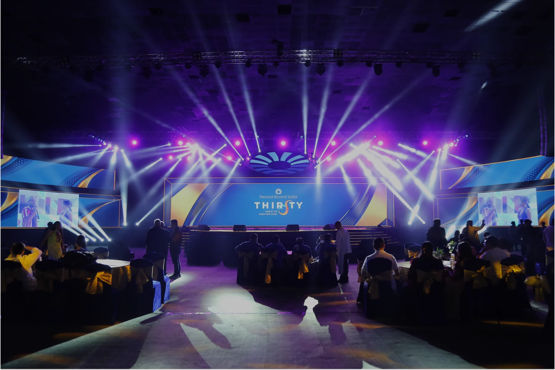
I designed the stage graphics and the presentation system, so the key visual ran across the main screen, the side screens and every speaker’s slides.
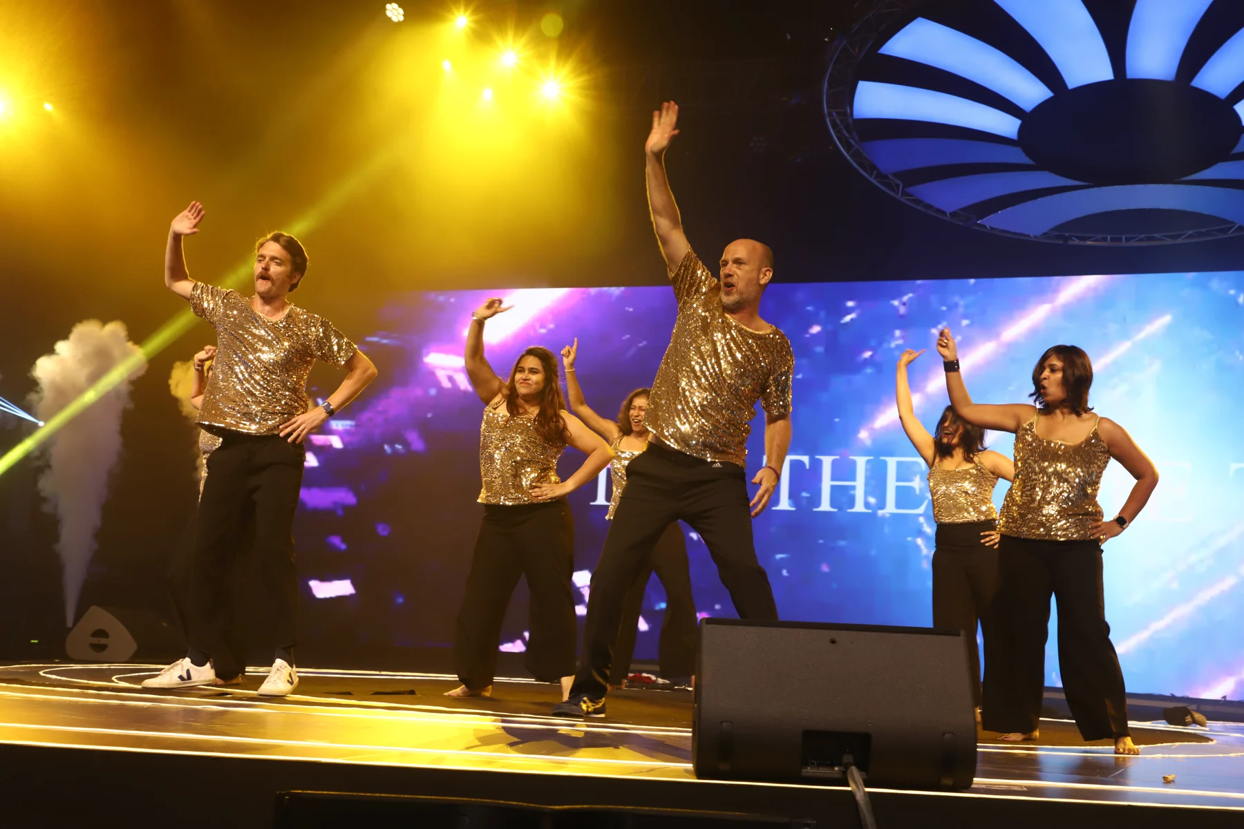
Keynotes, awards and performances all happened inside the same world, in front of 1,500+ people.
From wall to room
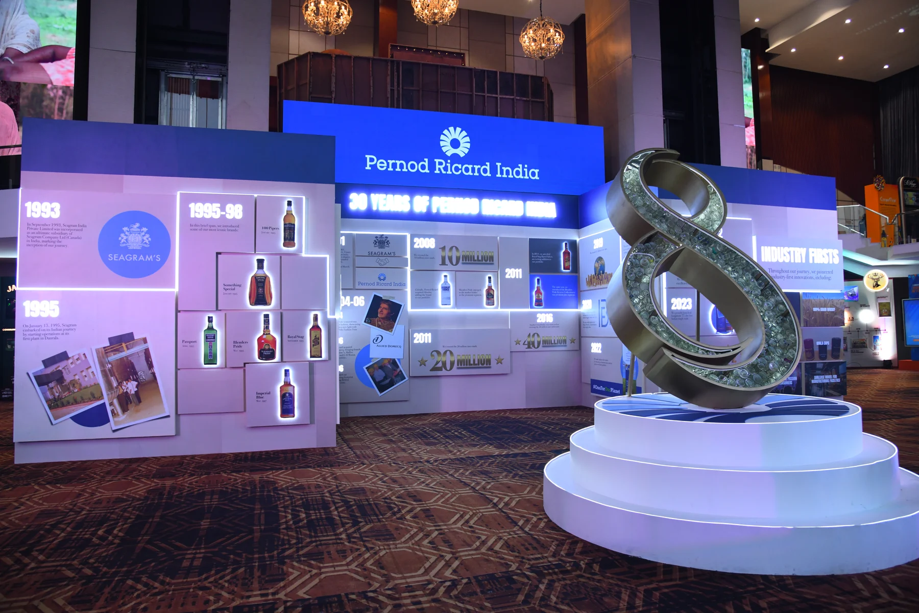
Thirty years of PRI, told on walls. I designed the history wall as flat artwork first, then the portfolio museum that built it into a room, alongside 15+ rare artefacts sourced from across the country.
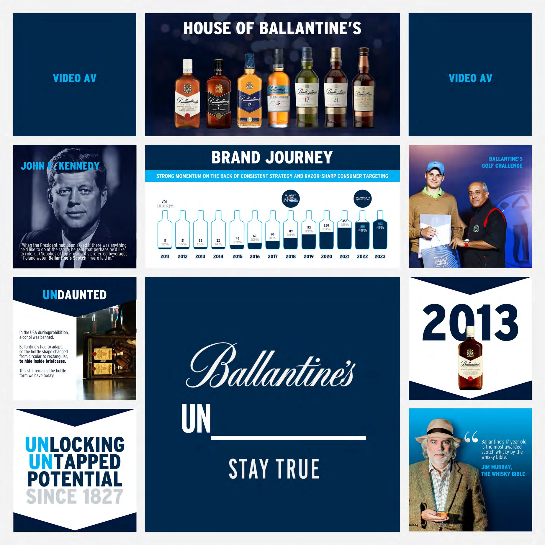
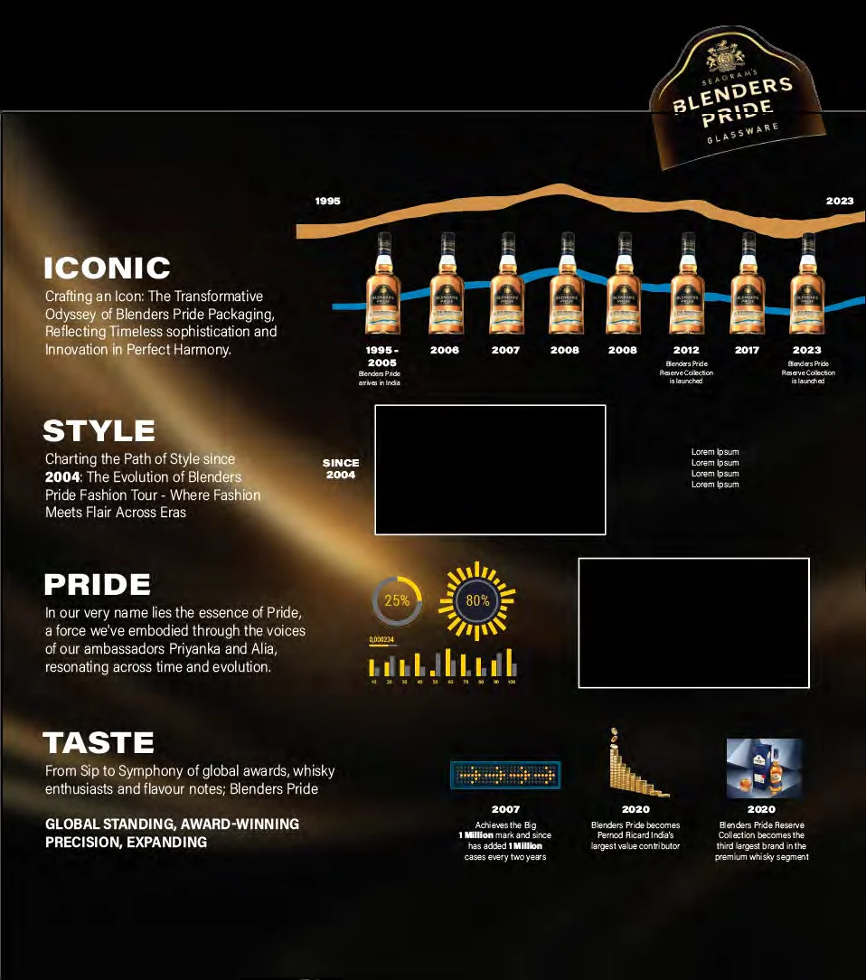
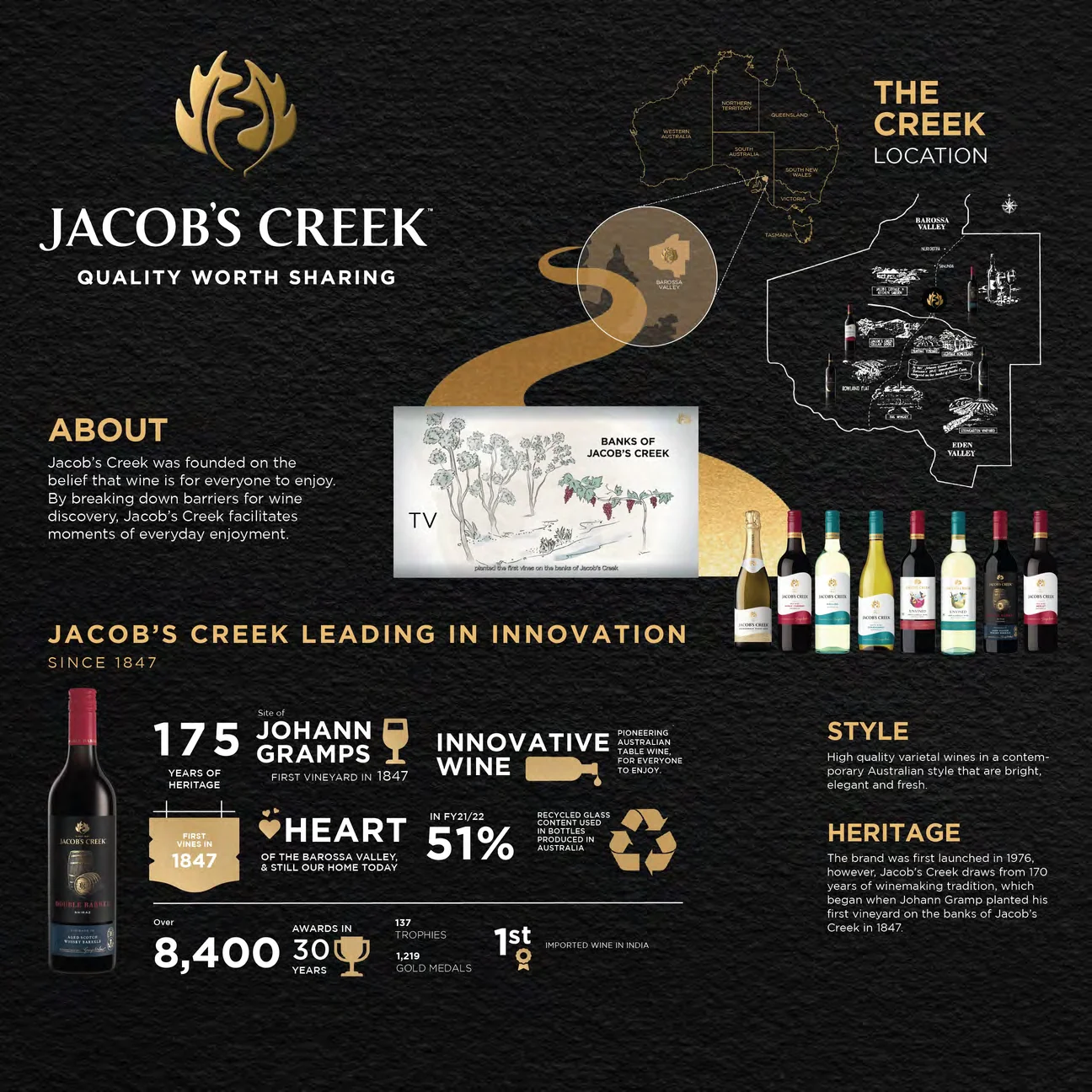
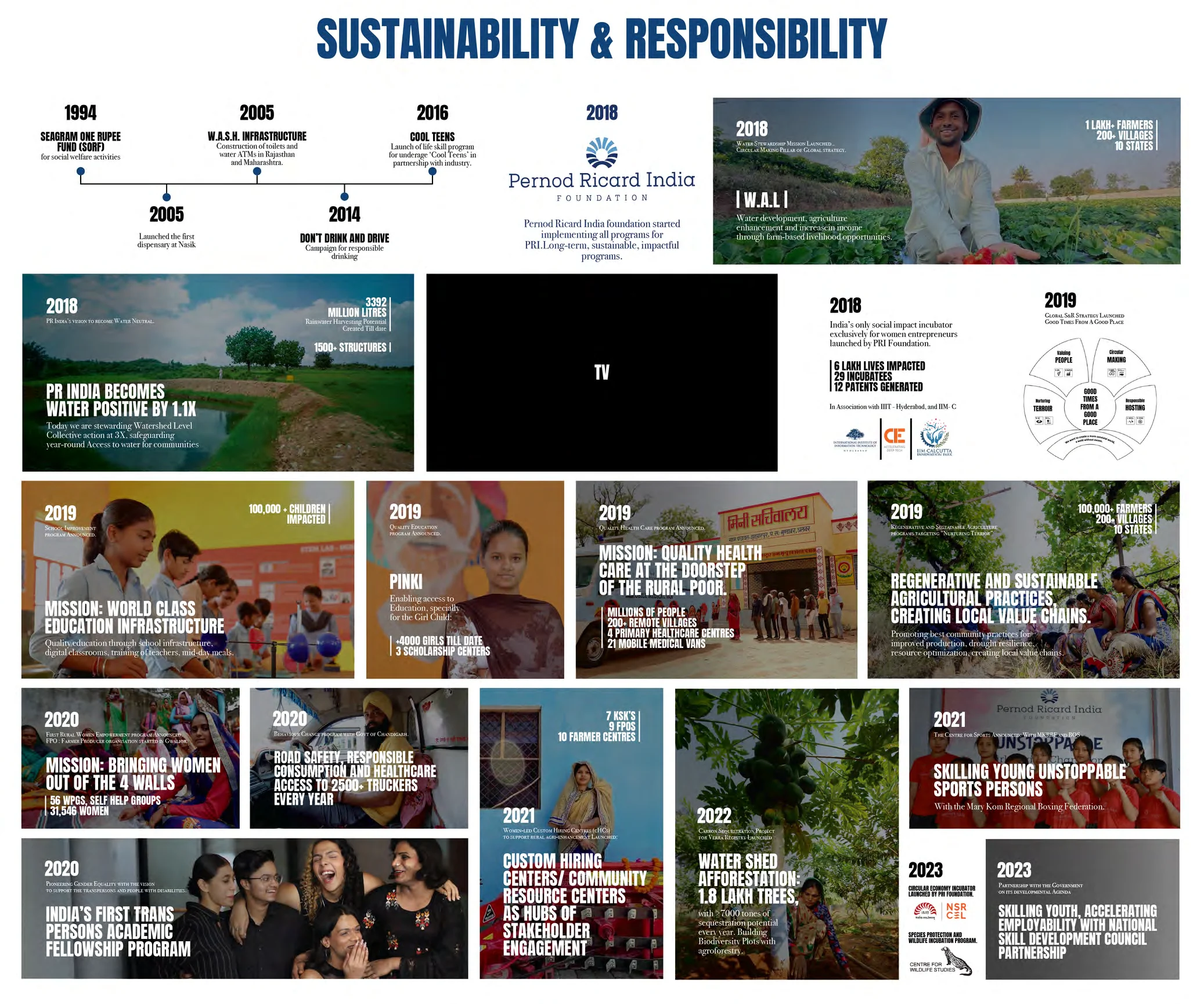
The brand journey walls for Ballantine’s, Blenders Pride and Jacob’s Creek, and the sustainability wall, followed the same system.

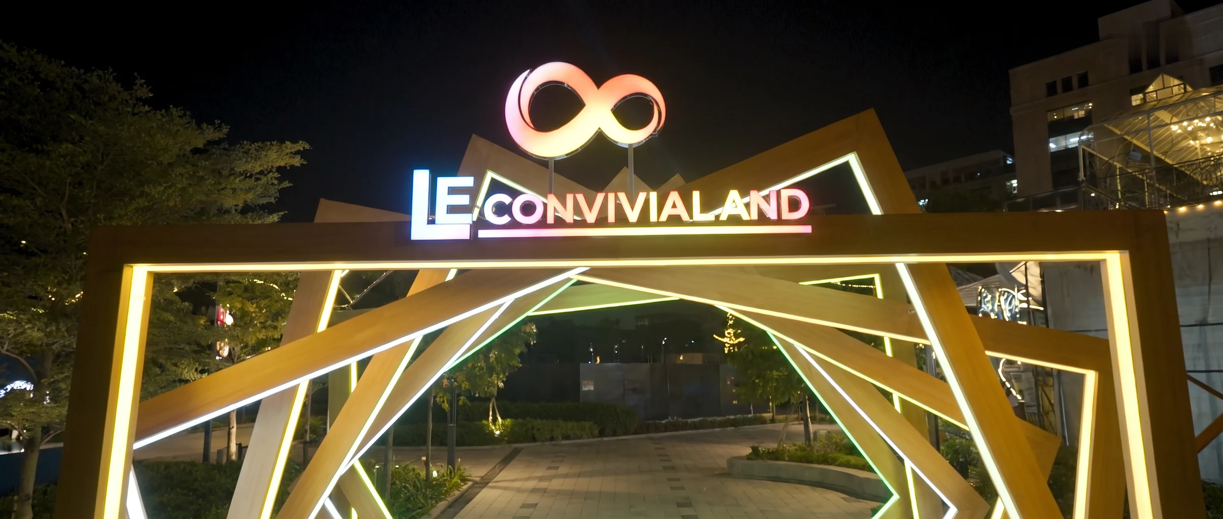
Le Convivialand
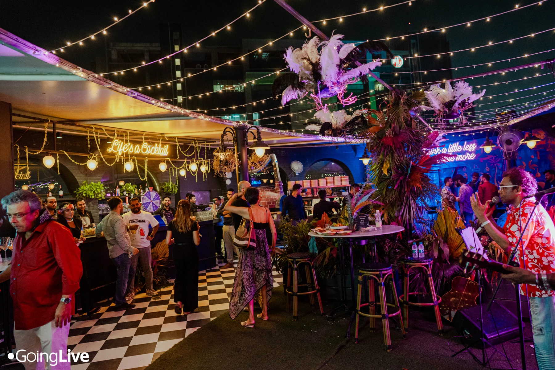
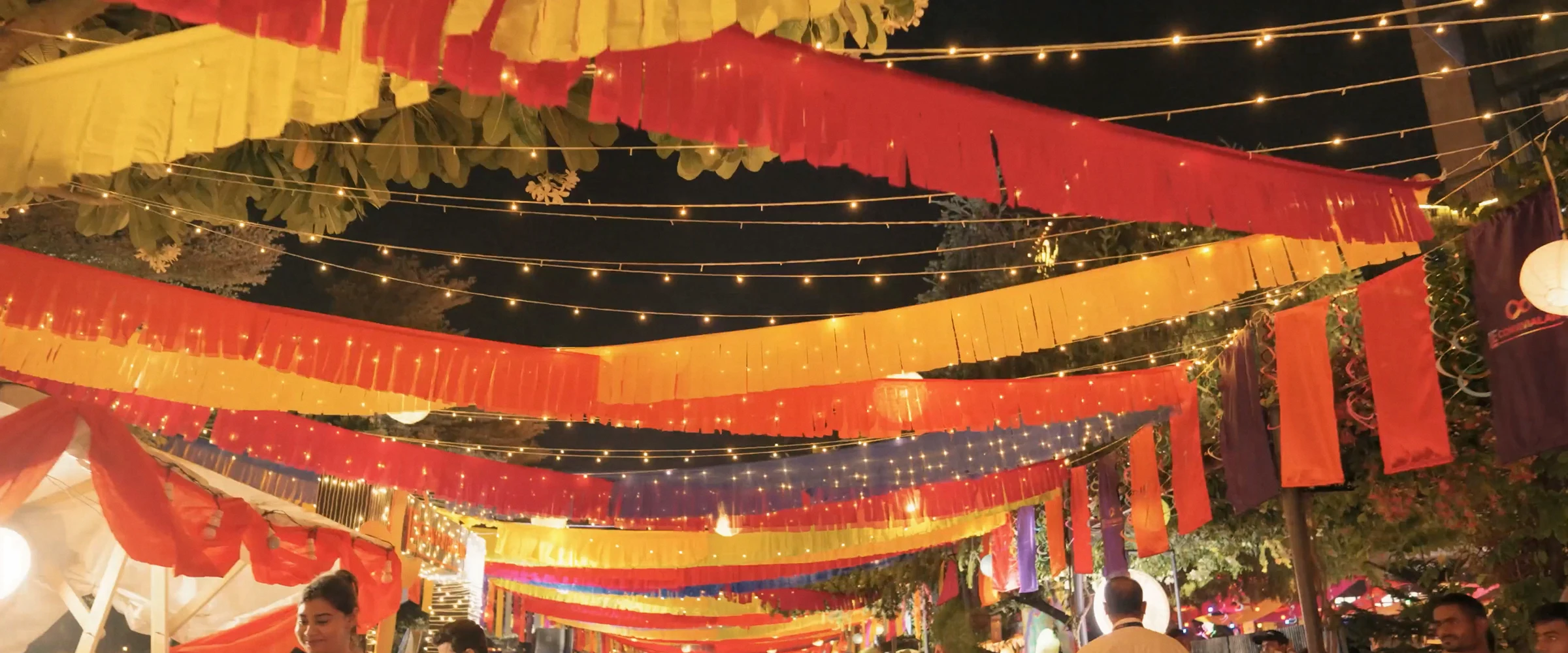
Le Convivialand was the bar-hopping street of the event, with 10+ brand takeovers. I designed its logo, key visual and background walls, and the engagement spaces between the bars.
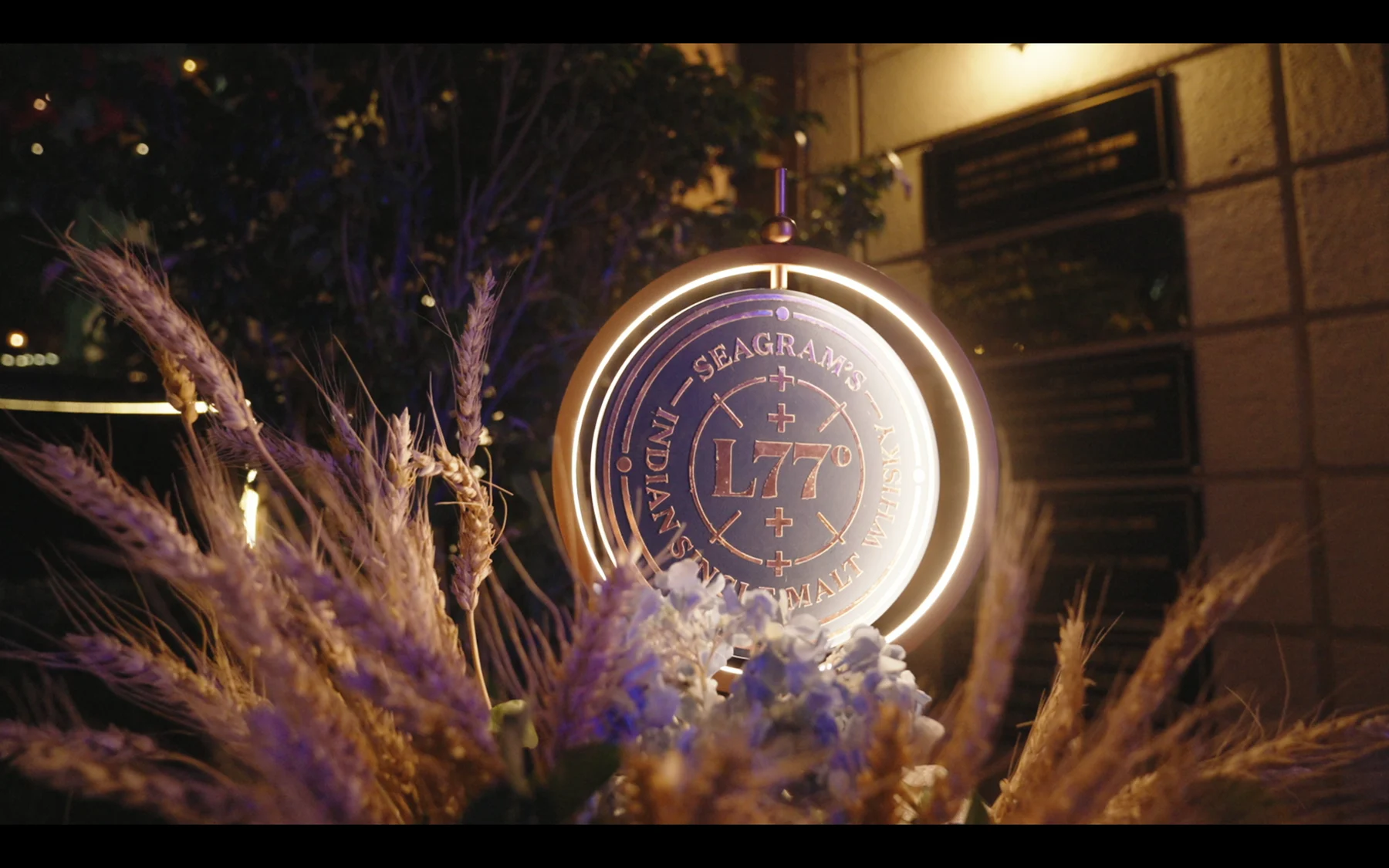
I also worked on the spatial direction of the Seagram’s procession, giving the brand a more atmospheric moment within the event.