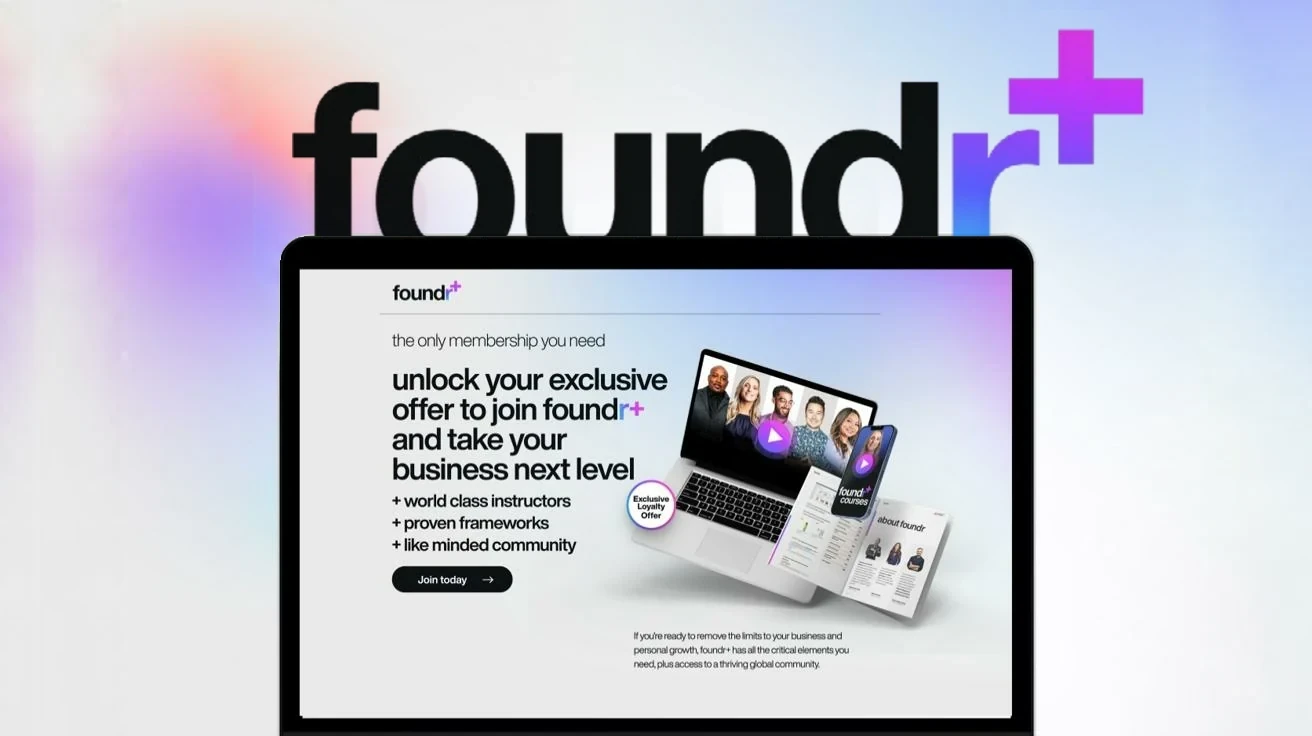
Foundr+
One membership for every course and magazine, with an identity of its own.
Foundr is a global media and education company for entrepreneurs. In 2022 it launched Foundr+, a single membership that unlocks every course and magazine instead of selling each one separately. Think Netflix for business owners. As part of the in-house design team, under art director Apolonia Bronakowska, I helped build the new sub-brand’s identity and brand book, then carried it across the website and the social launch.
- 3.6Mfollowers
- 174countries
- 275+podcasts
- 23+courses
- 111+magazines
+ Foundr in numbers
Where Foundr started.
Foundr reaches entrepreneurs through magazines, podcasts, YouTube and online courses. Its identity was bold and direct: a black wordmark with a red r, all-caps condensed Helvetica headlines and a simple call to action, “Ready to build?”
Every course had a colour of its own, and only the r in the logo changed to match it. That one detail became the starting point for Foundr+.

+ The original wordmarkBlack, white and red
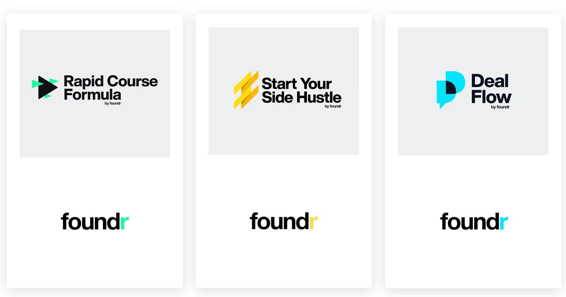
+ Course brandingOnly the r changes colour

+ The original voiceLoud, all-caps and red, from the 2021 brand book
Every course in one letter.
Foundr+ needed a presence of its own without breaking from the brand people already trusted. The answer was already in the old logo.
If each course had its own colour, a membership that holds every course could hold every colour. The red r became a gradient, and gained a plus.

+ From r to r+One colour per course, to all of them at once
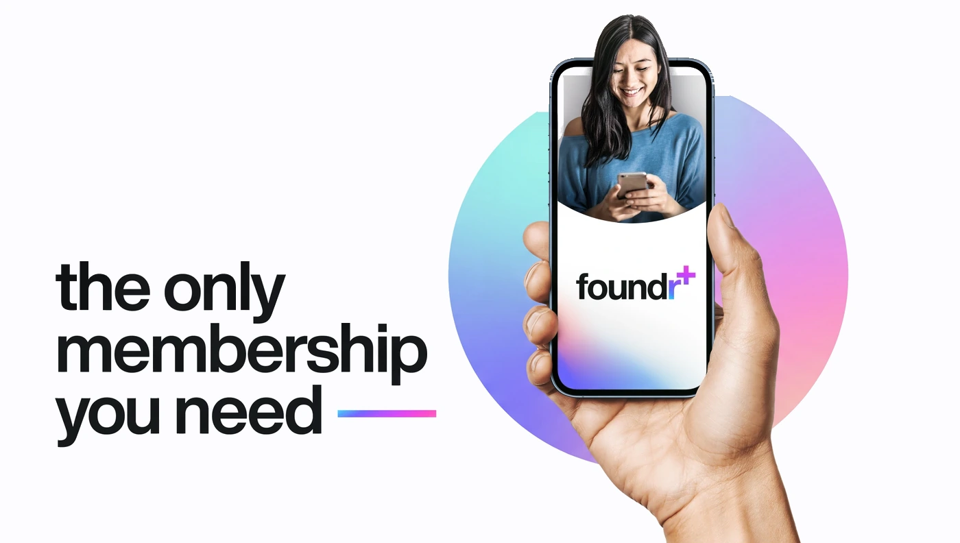
+ The offerThe only membership you need
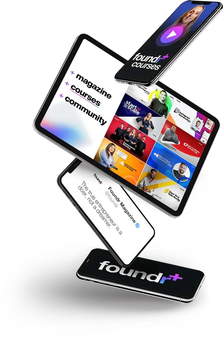
+ What’s insideCourses, magazines and community
Playful, but never loud.
Black and white stay at the core. A gradient built from five colours adds the energy, and the mesh never covers more than a quarter of a background, so it reads as a glow rather than a takeover.
Condensed, all-caps Helvetica gave way to Helvetica Now in bold lowercase. Body text is in sentence case, buttons are black and end in an arrow, and the gradient is saved for the plus and a single line.
Up to 25% of a background#0F1214#FFFFFF#EAEAEA+ Colour paletteBlack and white, plus the gradient
+ BoldLowercase, set tight
+ RegularSentence case
+ LightCaptions and detail

Foundr+ is your all-access membership to entrepreneurial education, with world-class instructors, proven frameworks and like-minded communities.
+ Type hierarchyFrom the short brand book
Foundr+ is
- Playful
- Exciting
- Sophisticated
- Engaging and personal
Foundr+ is not
- Cheap
- Cluttered
- Formal or corporate
- Shouting
+ Brand characterFrom the short brand book
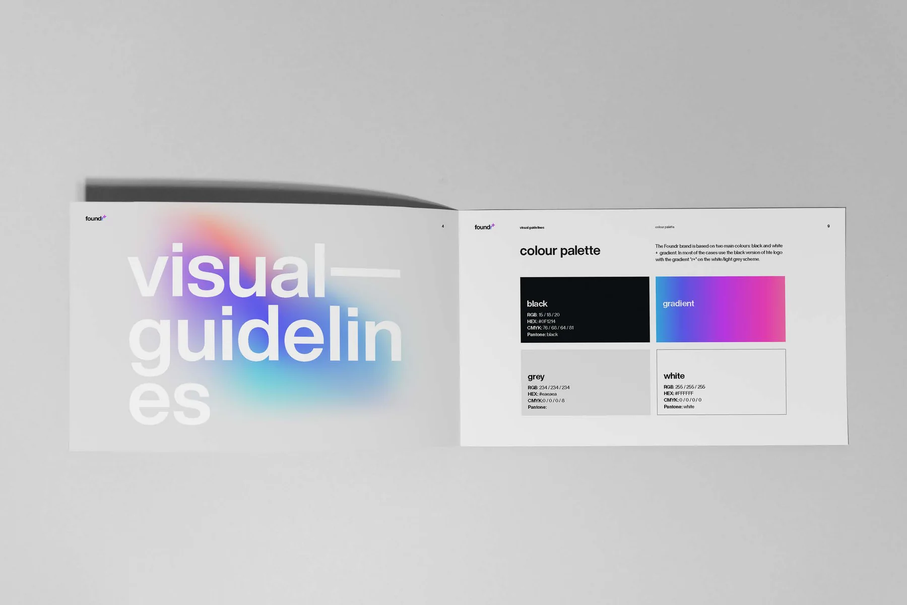
+ Brand bookVisual guidelines for the wider team
One journey, from first click to member.
I helped design and build the front end of the Foundr+ websites, from the membership landing page to long sales pages, banners and updates to the course catalogue.
Shared type and gradients make every page feel like one experience, from the first click to becoming a member.
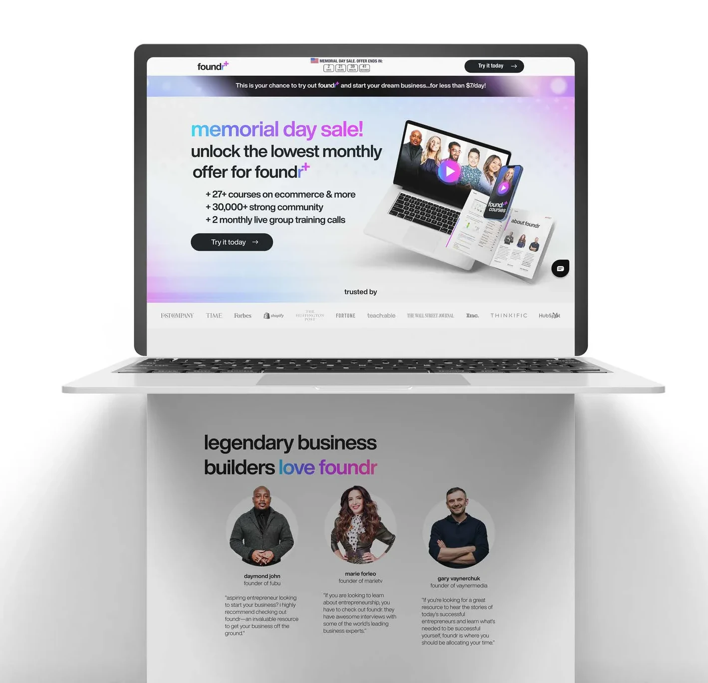
+ Landing pageMembership offer
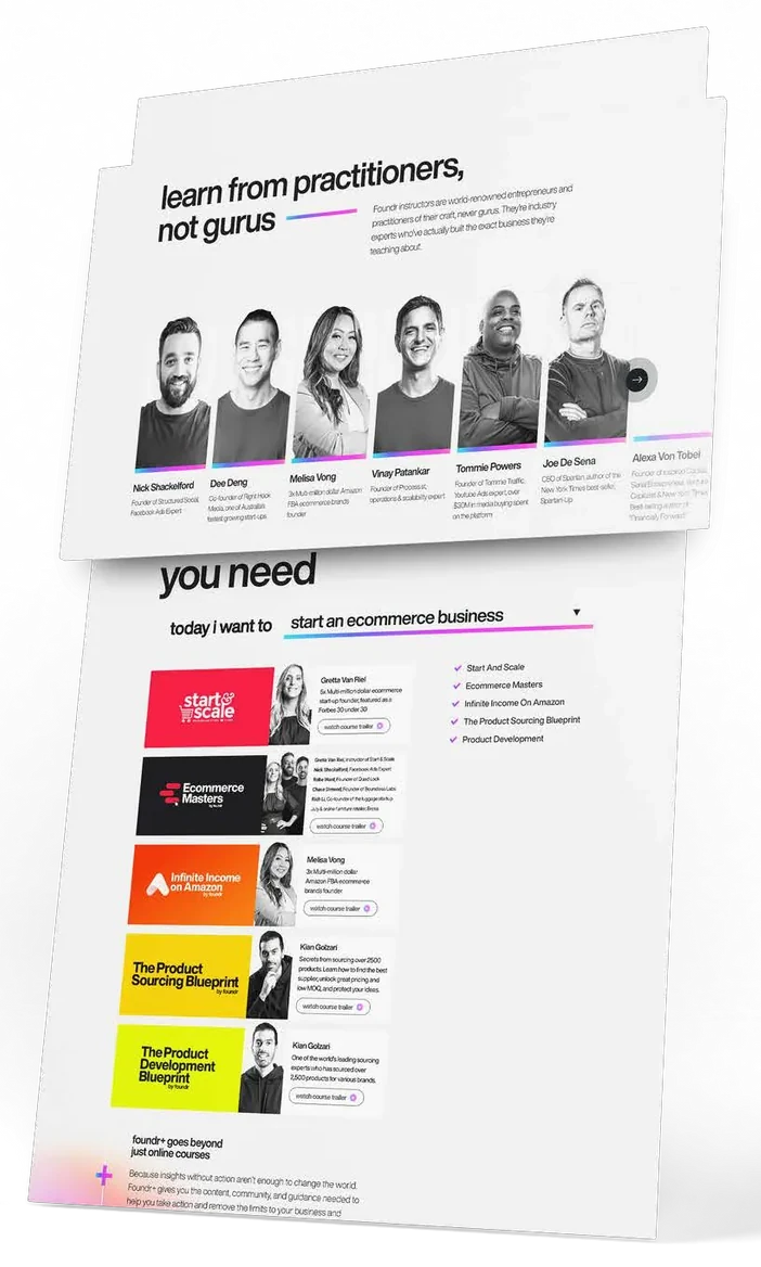
+ Sales pageInstructors and courses
+ Project film
- Apolonia BronakowskaArt director
- Olha HrytsanSenior designer
- Sheila DesamitoGraphic designer
- Mallika JoshiGraphic designer
- Michelle PatinoGraphic designer
- Dusan JevticUX designer
- Leana Van Der MeijdenLead paid creative producer
- Balazs FelingerVideo editor
- Mario AgudeloVideo editor
- Gabriel RezendeVideo editor
Built to move through social.
Educational carousels turn the identity into short, readable sequences: a bold lowercase hook, a gradient highlight and a clear next step.
Quote posts and stories put Foundr’s instructors front and centre, in the same type and gradient.
+ CarouselGrowing on Instagram
+ CarouselStarting a small business
+ PostsHooks, built from the type and gradient
+ StoriesInstructors front and centre
+ On the feedOne recognisable language, post after post