Leegality
I designed Leegality’s regulatory playbooks one at a time, and the same decisions kept coming back. I used AI to find them across my finished pages. I decided which ones became rules and wrote them into a Figma system, and the team designed every playbook after that from it.
It started with pages, not a system.
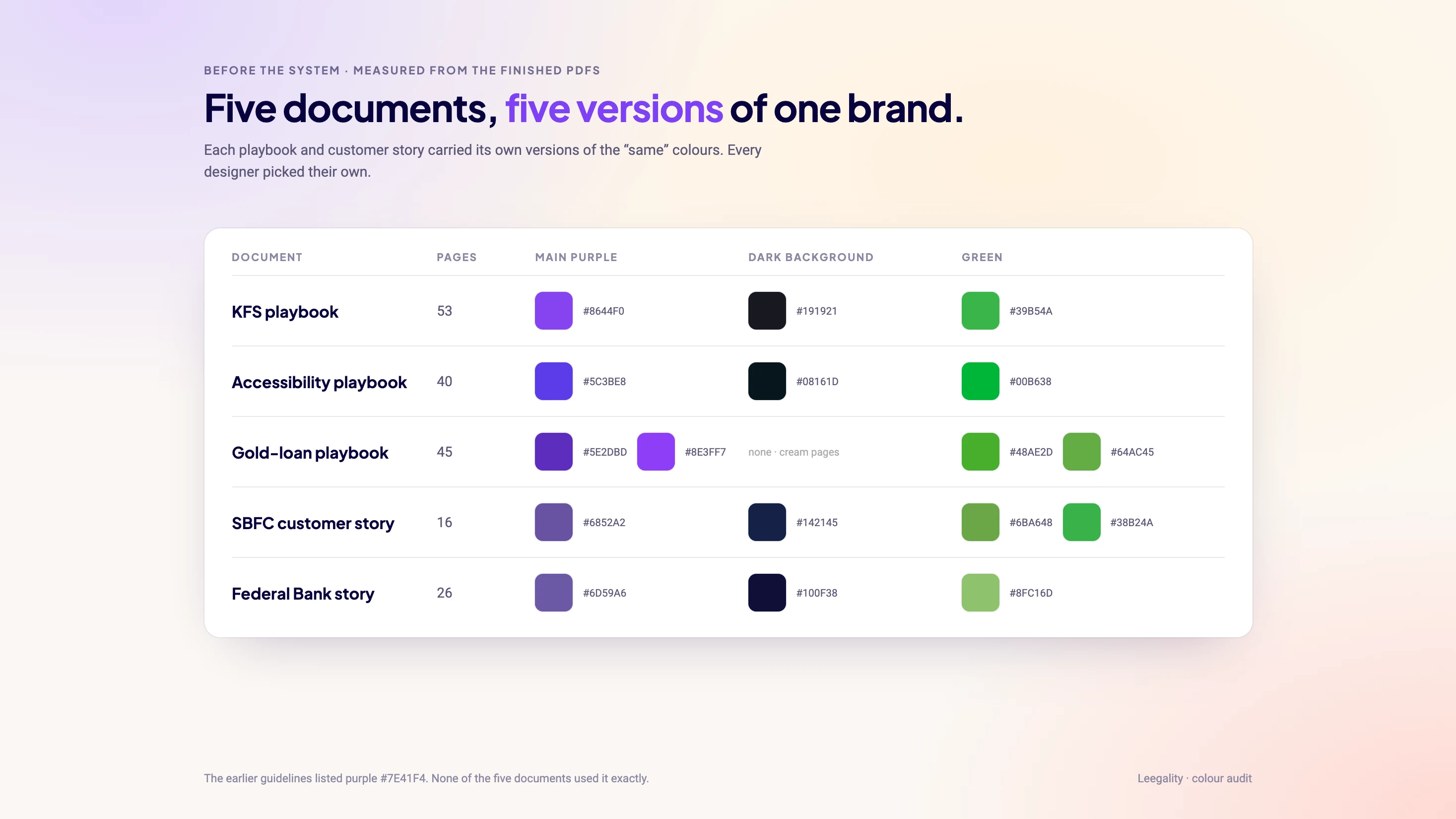
Each playbook, from KFS to gold loans to accessibility, was designed from a blank file. The identity I inherited had a logo, nine colours and three fonts, but no rules for using them together.
Let AI read the work.
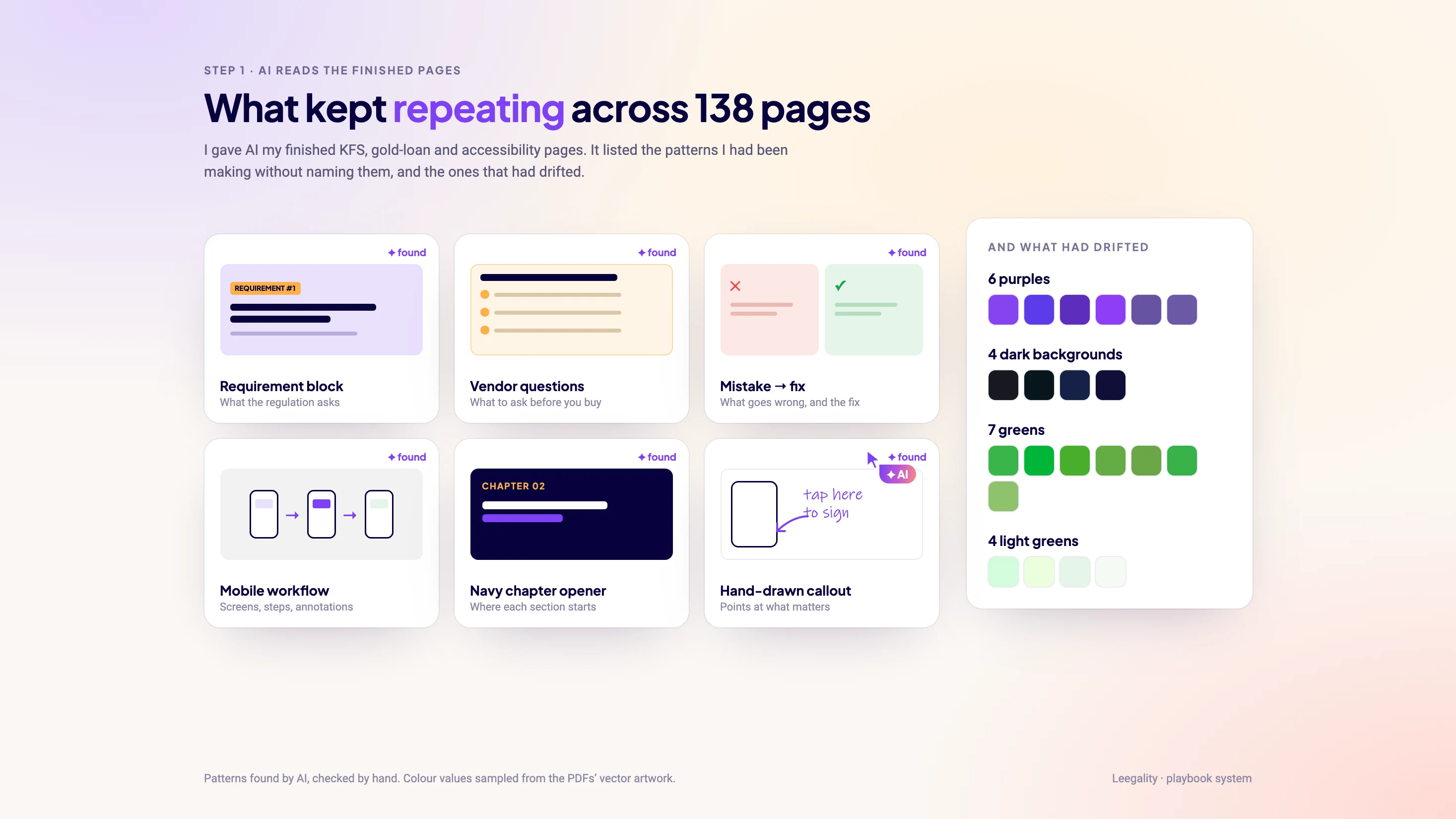
I gave AI my finished playbook pages and asked what kept repeating: the blocks, how each colour was used, the type sizes, the way notes pointed at screens.
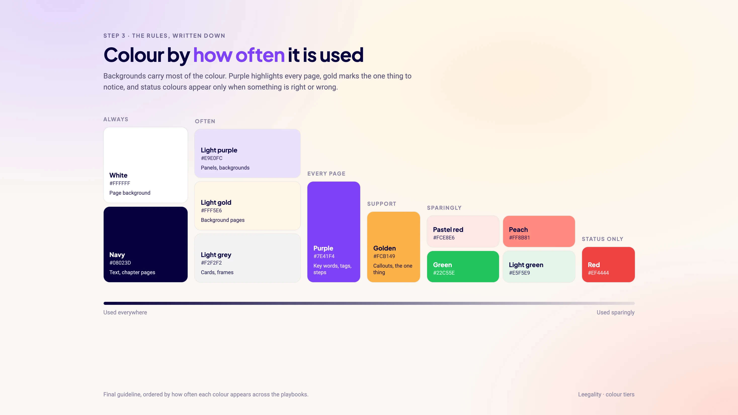
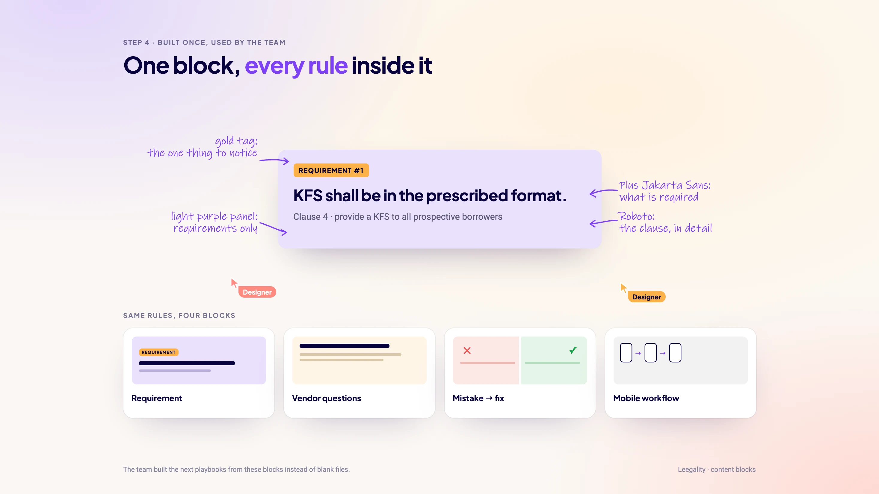
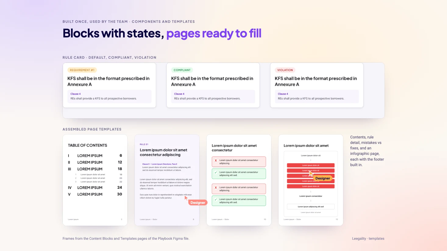
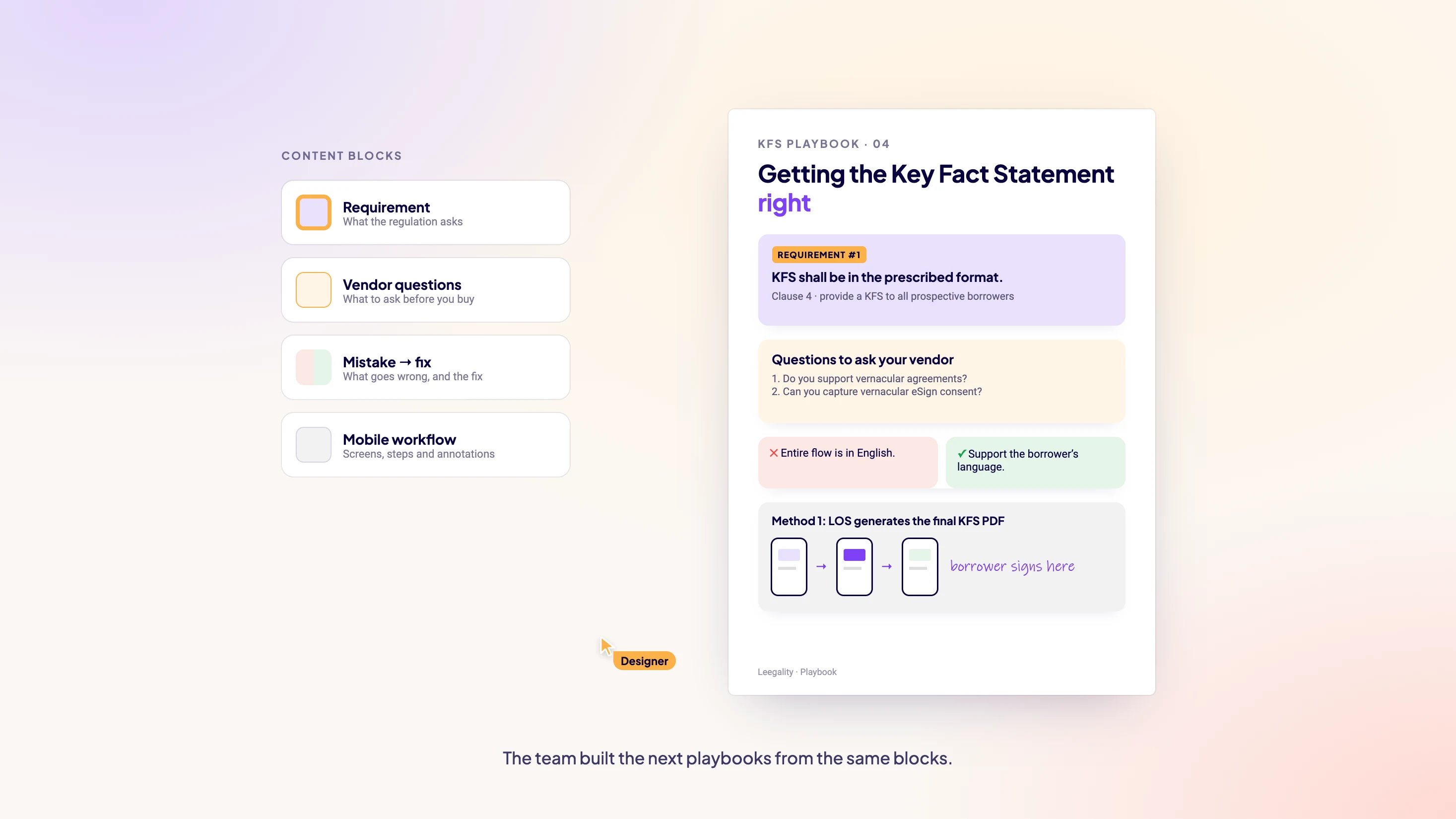
It found patterns I had been repeating without naming them: a requirement block, a vendor-questions box, a mistake-and-fix pair. It also found ones I hadn’t meant to make: six different purples, five dark navies and seven greens.
AI noticed. I decided.
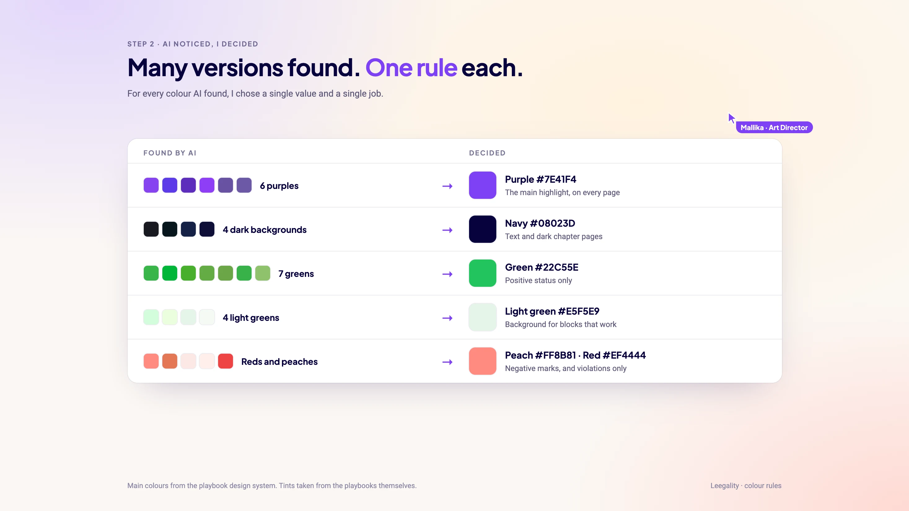
Finding seven greens was AI’s part. Deciding there should be one, and that it should only ever mean “compliant”, was mine.
I went through every pattern the same way: is this a real rule, or a one-off?
From artwork to components.
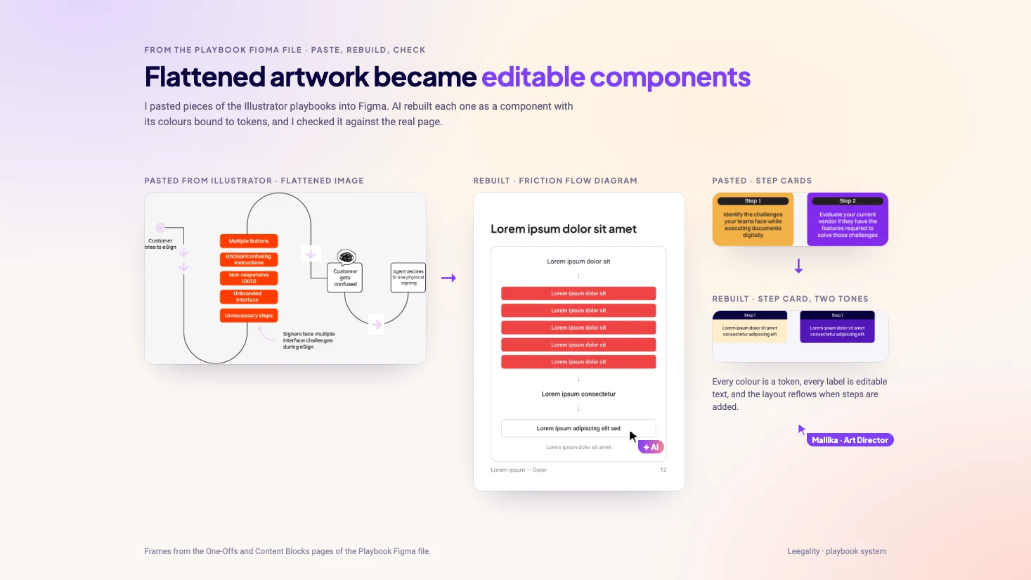
The finished playbooks lived in Illustrator, many of their pieces flattened into images. I pasted them onto a scratch page in Figma, and AI rebuilt each one as a component: colours bound to tokens, text editable, a variant for every state.
Each rebuild was compared with the real playbook page before it went into the library.
Write the rules down.
Purple identifies, gold draws attention, peach supports, and green and red only ever mean status. Plus Jakarta Sans structures a page, Roboto explains, and Ink Free is kept for hand-drawn callouts.
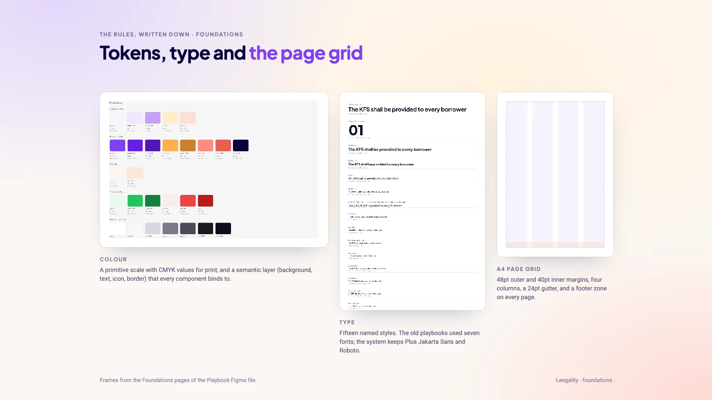
Underneath sit tokens for every colour, fifteen type styles and an A4 page grid with a footer zone on every page.
Keep it human.
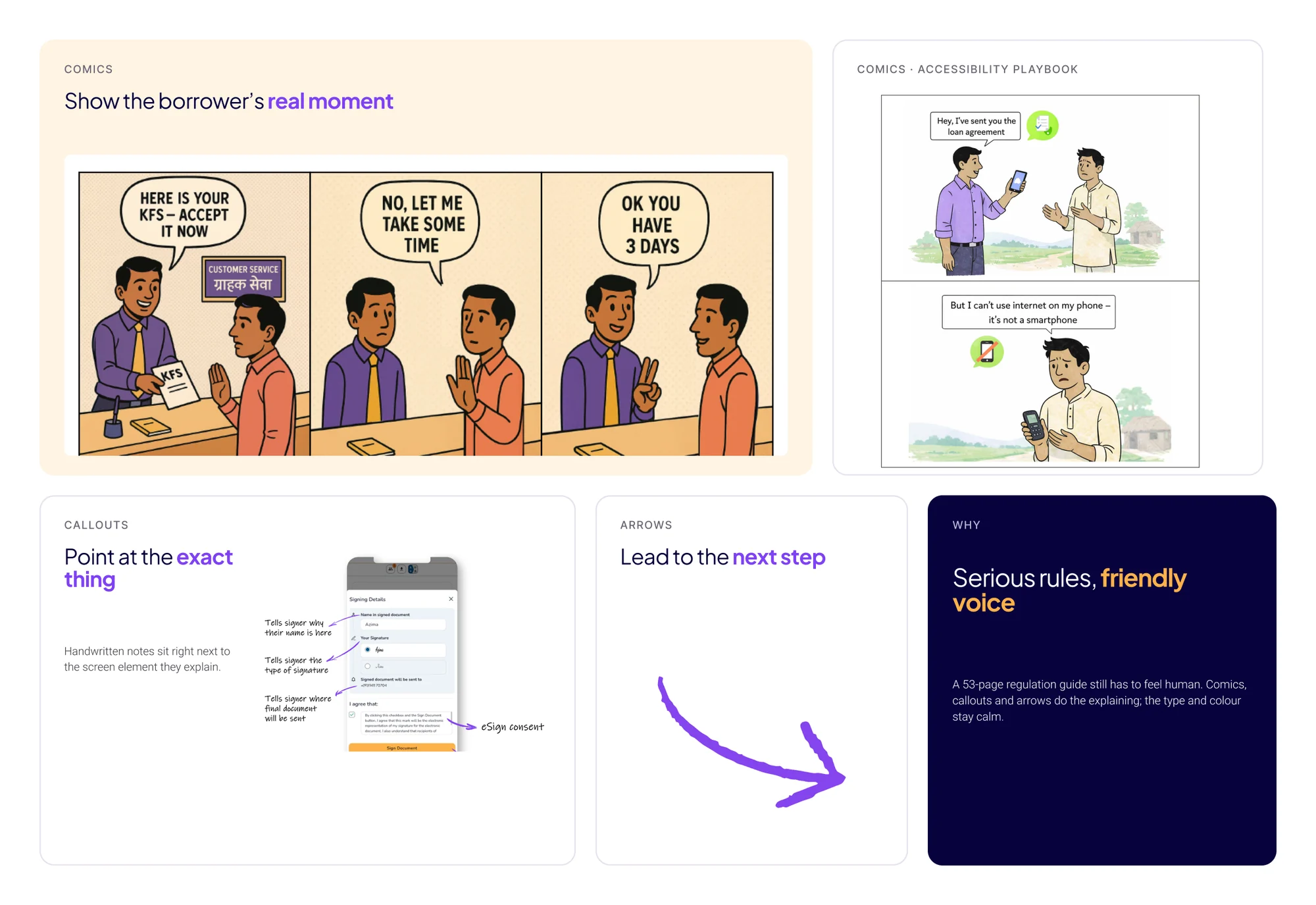
A 53-page regulation guide still has to feel friendly. Comics put real borrowers and branch staff on the page, and hand-drawn callouts and arrows point at the exact thing that matters.
The team built from it.
Once the rules and blocks were in Figma, the team didn’t start from a blank file either. They used the same blocks and rules for the next playbooks and posts, so new work stayed consistent with the system.
With earlier briefing and clearer feedback, design time after content approval fell from about three months to three weeks.
What I took from it
AI was fastest at noticing patterns across hundreds of pages. Deciding which of them deserved to become rules, and how they should look, stayed with me.
The real test of the system was the team. It worked once other designers could make pages that looked like they came from the same hand.
See the full system in the case study